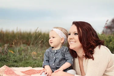
It is a pumpkin patch.. so, where is the pumpkin?

Seriously, why not using one or two to brighten up a mundane background, add color and balance the composition, which is fine here but rather boring? And then you would not need to explain that it is a pumpkin patch. That is what images are about. They spare you from explaining things.. if you catch my drift..
Had you worked on it, probably in some years they would say "Oh, that PUMPKIN photo?". What will they say about THIS image in 5 years time? Will they remember it? Just think about it. I am not criticizing, just giving you some food fo thought.
What are they looking at? Why not looking at the camera? This is not the kind of setting where you need to go that "experimental"

Eye contact would make it better, methinks..
Watch for croped limbs, it does not look good. The subjects are separated by the blurred background, which is fine, DoF is alright to me (more blur would be even better, but I do not know how fast your lense is), but lack of side light robbed the image of much needed depth and 3-dimentiality.
I personally do not like it when heads are being cut by the horizon line, but others may disagree.
If you look at your horizon line - it is not tidy, check the upper right corner: why this "bush" is there?
I guess the most important thing for you here is the faces, the smiles, the expressions, and this is alright. Problem is - if you concentrate on that mostly, you can easily overlook other components that make the image great.
Skin tones are a bit too yellow on my monitor. Probably addding some pink filter would help?
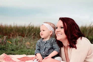
I also removed that bush behind her head, and it look better in my view.
I was nice, I am more grumpy usually

I love fall too. I also love avocados and JJ Cale.