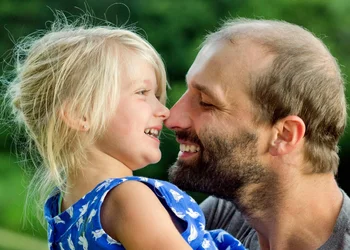
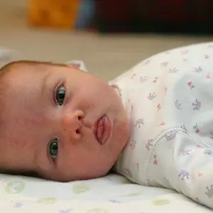
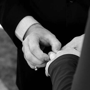
You captured some nicely timed moments in the first and third. The direction of light, the exposure - it works for me in those two.
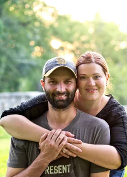
In comparison, the middle image falls short. It's actually not a bad capture of the two of them, it just feel very posed and forced when next to the other two shots. In this pose you've switched up the traditional positions of the couple - typically he would be in back, wrapping his arms around her, so that he is in the more "masculine" or "dominant" position (yes, the quotes are intentional). Maybe you posed them this way to match their personalities. Maybe you did it based on their relative body types. Either way, you broke a rule...and I have no problem with that. I do agree with Derrel that all of that overexposed headroom should go. Not only does it draw the eye, it doesn't work with how tight the shot is on each side.
Now, speaking of cropping, it looks like you cut each of these down to be ~5x7, yes? Straight up as digital images, as we're seeing them here, I would have cropped 1 and 3 a touch wider. In 1 I'd have given just a hair more space between his hair and the edge of frame, and in 3 I would have centered them horizontally (it's not fair that his arm has so much free space while hers is up against the edge) and given him a little head room. Now, if you intend to print and frame these, remember that a border around the shot is likely to be obscured by the picture frame. So to display the compositions I'm describing you'd need to crop even wider.