What's new

Critique please

delpi

TPF Noob!
Joined
Mar 19, 2016
Messages
10
Reaction score
4
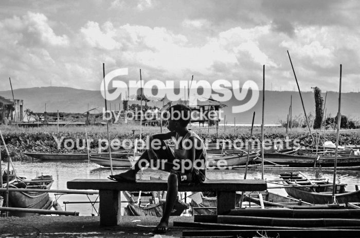
Quality is lowered because I used the copy which I uploaded to facebook and I couldn't find the original copy as of posting but please share what you think about this picture.

bw2_zpspogwjlaj.jpg
 
It's either not silhouetted enough or too much for me. It's in the area where it isn't sure what it wants to be.
 
It's either not silhouetted enough or too much for me. It's in the area where it isn't sure what it wants to be.
How do I add more silhouettes? My photoshop skill is like my forum title. "TPF Noob."
 
I'd remove the two masts making the v-shape, sticking out the top of his head. Improves the image imo. Put your thumb over them - see what i mean?
 
The subject in the foreground would be darker to be more silhouetted.
 
I'd remove the two masts making the v-shape, sticking out the top of his head. Improves the image imo.
You didn't like 'my favorite martian' ?
 
I'd remove the two masts making the v-shape, sticking out the top of his head. Improves the image imo.
You didn't like 'my favorite martian' ?

My wife can't stand "people antennae " lol. It is a major fault of mine when shooting people. Probably why I stick with birds. :)

Op: I like the concept! Basic composition could be improved in my humble opinion.
 
I'd remove the two masts making the v-shape, sticking out the top of his head. Improves the image imo. Put your thumb over them - see what i mean?
Oh, wow! I did cover it with my thumb and it did improve. I wonder why I didn't pay much attention to it.

The subject in the foreground would be darker to be more silhouetted.
Ah, I get it now. It should've been done the moment I took the picture.
 
.. please share what you think about this picture.
I can't tell what you intended with this photo. What I see is one figure in the foreground and a lot of texture in the background. There isn't enough detail in the figure for him to be an ideal subject, and the texture is fighting for dominance.
 
I think the figure is actually dark enough. The Martian antennae could go but I don't think they are a major item. What I do not like is having the figure centrally in the frame. He would be better to the right with more space to look into.

 

Create an account or login to comment

You must be a member in order to leave a comment

Create account

Create an account on our community. It's easy!

Log in

Already have an account? Log in here.

Back
Top Bottom