What's new

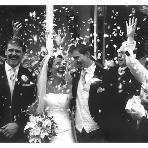
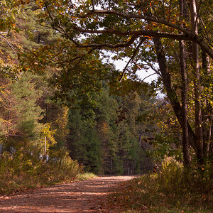
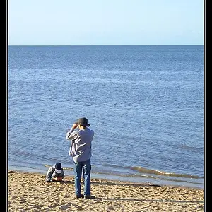
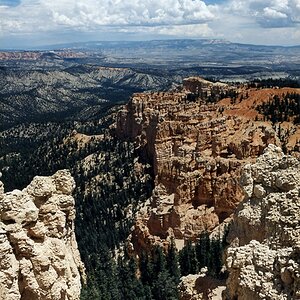
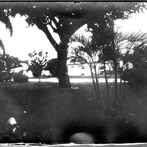
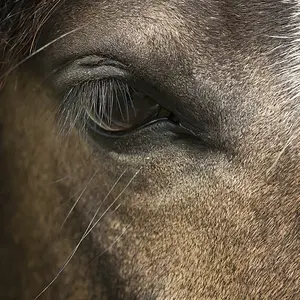
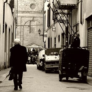
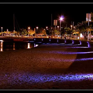
difference between my canon g12 & nikon d40x proof is in the pictures

Shadowbox

TPF Noob!
Joined
May 4, 2011
Messages
347
Reaction score
26
Location
usa
Can others edit my Photos
Photos OK to edit
d
 
Last edited:
#2 with the G12 is the best shot there...

The reason you're getting 30 second shutter speeds with the D40 is because you're trying to use 100 ISO with a slow lens in low light. You need to crank the ISO and/or use flash.
 
I will try that, I did not realize the lens was slow. The G12 was easy to learn how to do manual settings, with the Nikon I am having more difficulty. Thanks for the info.
 
I'm assuming your battery is the original, in which case it's time for a new one. This is common behavior for a rechargeable at the end of it's lifespan.

A blurred background is called a blurred background, or OOF background. Bokeh is the visual quality of said blurriness. "Good bokeh" means the blur is smooth, creamy looking, visually pleasing. A lens with less than good bokeh produces OOF backgrounds that look jagged, rough, basically not smooth and creamy, but unappealing visually. In general terms, more aperture blades = better bokeh. This can be seen with OOF lights in the background. A lens like the Canon nifty fifty has 6 blades, and OOF lights look hexogonal. The Sigma 50mm 1.4, OTOH, has 9 blades, and they're rounded, which gives OOF light sources a round, diffuse appearance. Any lens that produces excellent bokeh will have a higher number of blades.

The real source of your issues is the learning curve associated with using an SLR. You now have a body that is at it's best when you tell it what to do. Give it one wrong instruction, and you get something different than you expected. You gave a perfect example when you said you had your P&S set to auto ISO, but set your D40x to 100. Auto ISO lets the camera choose what it needs for shutter speed and ISO given your selected aperture, and it will generally give you a fast enough ss for handheld shots provided the light is decent enough. Manual ISO and aperture settings will allow the camera to choose only the ss, which, depending on light (such as indoor, like your shots) may not be remotely fast enough for handheld. This requires either a tripod or using flash for hand held. Increasing ISO will give you faster ss's, but at the expense of more noise. Start paying attention to all the numbers that display in your view finder when you half press the shutter button. They will tell you whether you should take the shot or not. Rule of thumb for handheld is shutter speed needs to be a minimum of 1/focal length to counter camera shake. For example, at 50mm, ss needs to be at least 1/50 of a second. A slower ss will result in a blurry or soft shot, as you've already seen.

Lastly, your max aperture has nothing to do with your camera. Aperture is a function of the lens. A camera can't set a wider aperture than the max aperture of the lens. You can't set aperture at 1.8 using a lens that has a max aperture of 3.5, for example.

In closing, read your manual. It's your best friend here. I realize the excitement of owning your first SLR and wanting to get right to work with it, but this ain't no P&S. I would also strongly suggest googling "Exposure Triangle". This will teach you how aperture, ss, and ISO are all related, and how they work together to give you proper exposure. I'm also going to recommend you purchase, or borrow from your library, "Understanding Exposure", by Bryan Peterson. You will benefit from reading it, and generally, you get much more positive feedback and answers on forums when you do your own homework. People get a little snarky when you want to be spoon fed, so if you can say "I read about the exposure triangle, but I don't understand x...", you'll get productive answers.

Keep shooting and have fun.

 
I would sincerely love to read and respond to your post, but am now just about crossed and blind due to the color font you have chosen. I apologize for not being able to participate in this thread in any meaningful fashion.
 
Not sure how you are comparing, the compositions between the d40 and other camera are different. If you want a real comparison, take the same exact shot, same exact settings.

The D40 should be a crisper image, but as someone else pointed out, composition won out on #2 with the G12.
 
I would sincerely love to read and respond to your post, but am now just about crossed and blind due to the color font you have chosen. I apologize for not being able to participate in this thread in any meaningful fashion.

LOL :)
 
Thank you for the feedback. I did do a lot of research on ISO and Aperture, which is why I was confused. I am just a beginner and from the various sources I have bookmarked & read from, including this site in the 'tutorial' thread, I picked up the same general idea that ISO is lower and Aperture lower to let in more light, I assumed that meant when it's darker you use the lowest settings to bring in more light. So sorry you thought I wanted to be spoon fed, I was just asking for a little help here. I have read my manual and many other sources as well.

I will look into a new battery because this one died very quickly so I am assuming that could be an issue here, thanks for the suggestion. I don't know why people are snarky but whatever, that is their own issue. I can manually set ISO and aperture on my canon and it is fine. I have learned those settings well, I can use auto, or I can us M, AV, TV or P & get the results I want.

With the Nikon I play around with the settings and it still doesn't matter. I have also put the ISO up to 800, this gives orange photos which are blurred. Thank you for the quality post Subscuck, I have seen that book on here as a recommendation many times.

I like purple font, sorry.
 
Last edited:
Pictures coming out orange are a result of incorrect white balance... Auto white balance is generally not recommended, if you know your color temperature and can dial it in, that's great. If not, even the presets like "tungsten" "cloudy" "flash" are pretty accurate for most purposes. (I'm not a Nikon shooter, so I don't know how to get at the white balance, but your manual will). Blurry is probably because the shutter time is still too long. In the viewfinder, the camera will tell you what shutter speed it's using, whether you've set it, or left it up to the camera. A general rule if you haven't got a tripod, is to keep the shutter faster than 1/focal length. So if you're shooting a 50mm lens, 1/50 second is a good place to start. Depending on the lighting conditions, you may need more than 800. Higher ISO numbers result in a brighter image, not lower. You are correct that a lower aperture number lets in more light. If you haven't got a firm grip on this stuff I'd google around for exposure triangle.
 
Thank you! I think I finally understand, with the Canon I am using around ISO 400 and let aperture set itself. With the nikon I was putting ISO 100- I have a thing where I mix numbers up (dyslexia, hence why I bookmark everything or I'll forget it 5 minutes later), and I swapped in my mind which settings ISO should be at for more light. When you said that it refreshed it in my mind, and it's so funny because with the canon I don't forget that since the dial is on the outside with numbers on it I can visually see it going higher. With the nikon it's on the screen and that threw me. Thanks & yes I have the white balance set to auto, I will try to change it depending on my location. The room I was shooting in has yellow walls and a gold/red rug & a rich color wood floor, so I think it must be the reason why they were all turning orange. I was scared to mess with white balance when I haven't even grasped how to take a darn picture yet (OMG) but I am going to try it now.
 
I like purple font, sorry.
You might like it, but some number of other people won't.

The puple text has less contrast with the light gray page color than black does, making the purple text more difficult to read (poor readability). That's why the forum uses black as the default color. Black has better readability. The default, san-serif font is also chosen for good readability on electronic display devices.
 
The puple text has less contrast with the light gray page color than black does, making the purple text more difficult to read (poor readability). That's why the forum uses black as the default color. Black has better readability. The default, san-serif font is also chosen for good readability on electronic display devices.

It amazes me daily how few people actually understand that.
 

Create an account or login to comment

You must be a member in order to leave a comment

Create account

Create an account on our community. It's easy!

Log in

Already have an account? Log in here.

Back
Top Bottom