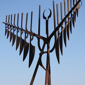
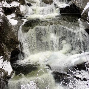
The issue I have with those odd crops is that they make both images feel really tight.
And it was hard to tell that you are a structural engineer from your name and posts, so please forgive people here if they can't read into your life behind the monitor

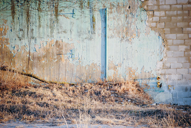
1- I think the image is a bit dull, too much going on and yet not enough. It seems you wanted to focus on textures and/or patterns, but focused on both of those and neither really.
The branch bits at the top and the grass at the bottom just add to the amount of visual stimulus in the image.
Looking at it, I'm personally drawn to the right side where you have a brick wall and pieces missing. I think focusing on just that, zooming in, and using the curve of there would be pretty interesting
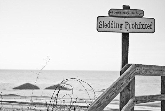
2- Intersting setting shot and i can see this working with a bunch of other images of the area in a series or set. But stand alone, not sure. I would of maybe move that sign to the left of the frame and done more with the wood ramp/railing
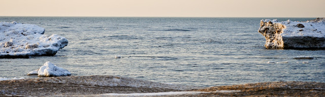
3- Tight crop. The horizon is really tight up there, not much breathing room. My eye is drawn straight into the void in the middle, but I believe you tried to make the pieces of rock on either side the subject? Not sure
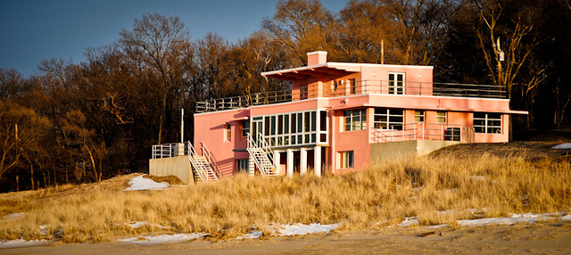
4- Comes off as more snapshotty, taken from standing straight up and straight on the house. Its an ok shot, but nothing really more for me.