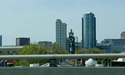
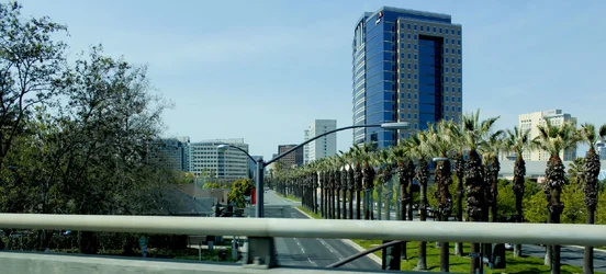
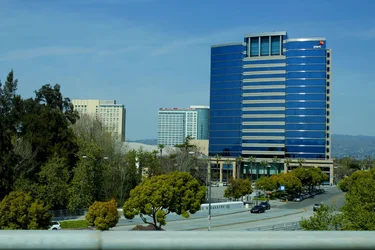
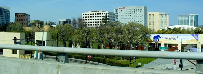
The exposure is decent, if a little cool. There is really no composition to speak of, the image seems a bit unintentional. The 'L' in Motel is cut off awkwardly, overall the railing is intrusive, creating a closed edge on the bottom, yet open at top making the image bottom heavy. Cropping on the edges seems awkward, with just little slivers of buildings. The right side works better than the left.
What exactly caught your interest here?







![[No title]](/data/xfmg/thumbnail/41/41797-ed370d68dae70f5b0a7252ec2d525912.jpg?1734176109)

![[No title]](/data/xfmg/thumbnail/41/41799-fe172a668fba7717bf773664387d64aa.jpg?1734176110)