What's new

Editing

lisameowrie

TPF Noob!
Joined
Feb 19, 2015
Messages
94
Reaction score
13
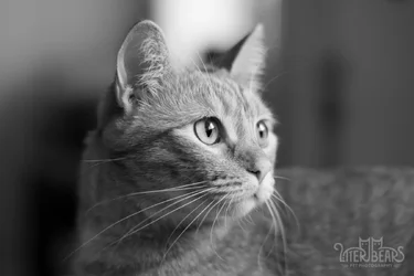
Testing a new lens and this is SOOC. How would you edit this? I don't want to over edit or under edit my images. Any pointers?
 

Attachments

  • DSC_0086.webp
    DSC_0086.webp
    85.1 KB · Views: 150
DSC_0086-2.webp
DSC_0086-3.webp
My edits...

B&W and color
 
I'm not the one to comment on editing, but that bright area above its head is distracting.
 
A nice B&W edit by RDenhardt above, and a perfectly acceptable, slightly cool, realistic indoor window light-type color edit too. But as mentioned, the light-colored area located right behind the ears and at the top of the frame is distracting. Watching out for background attachments with the subject to the main subject in portraiture is one of the most important parts of advanced level photography. The fact that that "white thing" has a very hot, close-to-255 or detail-less white patch is making the photo less-successful than it might have been. The very sharp edge between that white thing (refrigerator with afternoon light hitting it?) and the right hand side's cool, dim tan tones makes the white area in the picture seem very weighty, visually.

 
I would also suggest that the logo be moved to the lower right hand corner of the image...having the logo in the upper left on the smooth background is making the logo "an element of the picture", and that's not good...the logo as positioned is stealing from the picture's impact.
 
If I was editing that pic I would not do much to it. Little bit of sharp / saturation / contrast.
Question from a rank amateur ....would you show a customer more than 1 version of a pic like this?

I would also suggest that the logo be moved to the lower right hand corner of the image...having the logo in the upper left on the smooth background is making the logo "an element of the picture", and that's not good...the logo as positioned is stealing from the picture's impact.

Funny I was thinking something similar:
cat5.webp
 
I would also suggest that the logo be moved to the lower right hand corner of the image...having the logo in the upper left on the smooth background is making the logo "an element of the picture", and that's not good...the logo as positioned is stealing from the picture's impact.

Ah ok, note taken. In this instance though, I accidentally exported from Lightroom not knowing I had the box checked.
 
I'd adjust the white balance as the camera's auto WB is blue. Hard, but try and fight down the bright spot in the background. Crop and a slight increase in contrast.

Joe

View attachment 98510

I really like this edit! A lot of my photos tend to be on the blue side. :\ Thanks for your input.
 
I'd adjust the white balance as the camera's auto WB is blue. Hard, but try and fight down the bright spot in the background. Crop and a slight increase in contrast.

Joe

View attachment 98510

I really like this edit! A lot of my photos tend to be on the blue side. :\ Thanks for your input.

It's so easy to deal with that. You had the camera set to Auto WB. Auto WB is sometimes close but almost never accurate. The final color balance you end up with is your personal choice, but it's nice to start from consistently accurate. Go to the quickie mart and get one of these:
SN220.jpg

Cut a flat piece out of the lid and keep it with your camera -- problem solved. Use it to either set a custom WB or shoot it as a WB reference.

Joe
 
Here's what I thought. Some banding/detail loss on the ear hair because of the whole "editing a JPEG" thing, but:

17090917685_94609c1511_b.jpg
 
Here's my edit.
 

Attachments

  • SAVANNAH10-2.webp
    SAVANNAH10-2.webp
    76.2 KB · Views: 174

Create an account or login to comment

You must be a member in order to leave a comment

Create account

Create an account on our community. It's easy!

Log in

Already have an account? Log in here.

New Topics

Back
Top Bottom