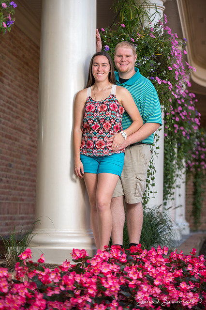
A few thoughts on her pose...
By having her move her right hip and shoulder away from the camera, you would have created a more flattering look by slimming the waist and lengthening the torso. Had she moved her left foot forward and crossing the right leg further, you would have created more defined diagonal lines. Also, if she pushed her butt backwards towards him, again this will accentuate the more flattering look. No double entendre intended.
The hands need to be on different planes as you have shown, but a good rule of thumb is "if it bends, bend it". The right arm dangling straight down gives no visual impact (read typical and boring).
OMG, they have no feet! Either have a lower PoV where the foreground elements rise higher on their legs or have a higher PoV where their feet are visible. Cutting off at the ankles is not the best choice.
Some Fill light would have lessened the shadow on the column. BTW, is it straight?
Thanks for sharing. Just my 2¢.





![[No title]](/data/xfmg/thumbnail/41/41906-b9041eb5a3fa48eb5d5084ac2198a75c.jpg?1734176271)


![[No title]](/data/xfmg/thumbnail/39/39447-6e7679723d775935851f055bae9712ba.jpg?1734173538)