Exposure looks fine to me. It looks like a lightly overcast day, things should look a bit dreary and bland.
Keith's edit is a little over the top, to my eye. He's done a great job of separating the fence from the grasses behind, which definitely is something that needs to be improved over the original (in my opinion, etc) but I think he's pushed it too far. The separation should be enough to give visual clarity, but without looking weird. The bright white grass and the dark grey fence looks weird, to me. Grass isn't white, and if it's not really white it must be brightly lit, and where the heck is the light coming from that's magically illuminating only the grass?
Still, as an illustration of technique, it's excellent.
B&W conversion is something that we're obsessing over these days, a bit much. The advent of digital has given us gigantic panel of sliders and options that can be used to alter the conversion, so now we're developing Theories and Standards and Ideas, and one of the things people like to ***** about in other people's photographs is how awful their B&W conversion is. This is 99% a crock, and about 1% about not creating visual confusion with overlapping similar tonal values.
I prefer the original since it lets the middle tones breathe more. The shadows (or rather, lack thereof) suggest a lightly overcast day, so in order to feel right, I feel that the image needs to be subtle, grey, bordering on gloomy without quite going there. Keith's popped contrasty image goes too far, and loses that grey-day feeling. The result is another dimension of weirdness, which is 'why is this so high contrast? where are the shadows created by the hard light that's making this contrast? what's going oooooon?'
Higher contrast IS the fashion these days. Our eyes are taught by what we see, so others are likely to accept the higher contrast image as "natural looking" where I do not. I only relate what I see, how I react, and what the image makes ME feel, and I recognize (and so should you) that my taste and visual training is a bit dated.
 [/URL] Fence Color by jwbryson1, on Flickr[/IMG]
 [/URL] Fence B&W by jwbryson1, on Flickr[/IMG]
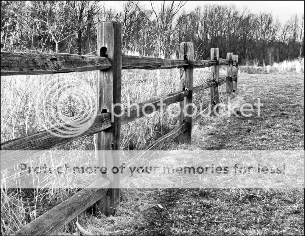
")


![[No title]](/data/xfmg/thumbnail/37/37604-7ad625e983f92f880eb65a264eeef5e4.jpg?1734170732)


