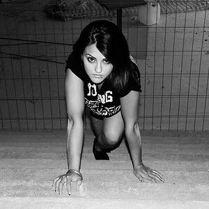
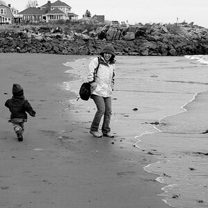
I thought I liked number 1 till I saw number 2! I love these. Her pose in number 1 looks very comfortable. Typically this would look "forced" but she looks very at ease! I love number 2!!!! This could be used for an ad, not sure what product but it has the feeling of a nice ad shot! I love it! Of course it doesn't hurt that she is quite nice looking! Cool stuff!
How much did you do in post? Mainly number 2? What method of going to B&W do you use? There are lots of B&Ws shown here, but so many times they look like "fake" B&Ws. You have a nice tonal range here.
hey..
thank u so much :blushing:
i didnt get ur 1st question (sorry my english is not that good) if u can explain to me....
And for the b&w i use photoshop filter called "Nik software- silver" :thumbup:
#1 has very harsh lighting and her face is actually under-exposed and she looks orange. I do like the pose, though.
I disagree about #2 having a nice BW conversion. Her skin looks awful and mottled or blotchy...the distortion of her right shoulder and her left wrist/hand is HORRIBLE!
#1 has very harsh lighting and her face is actually under-exposed and she looks orange. I do like the pose, though.
I disagree about #2 having a nice BW conversion. Her skin looks awful and mottled or blotchy...the distortion of her right shoulder and her left wrist/hand is HORRIBLE!