What's new

First Wedding - A few shots to C&C

Oilersrock

TPF Noob!
Joined
Jun 21, 2011
Messages
16
Reaction score
1
Location
Edmonton
Can others edit my Photos
Photos OK to edit
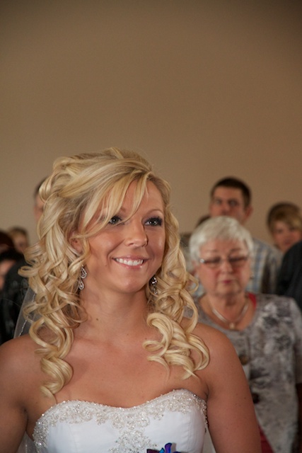
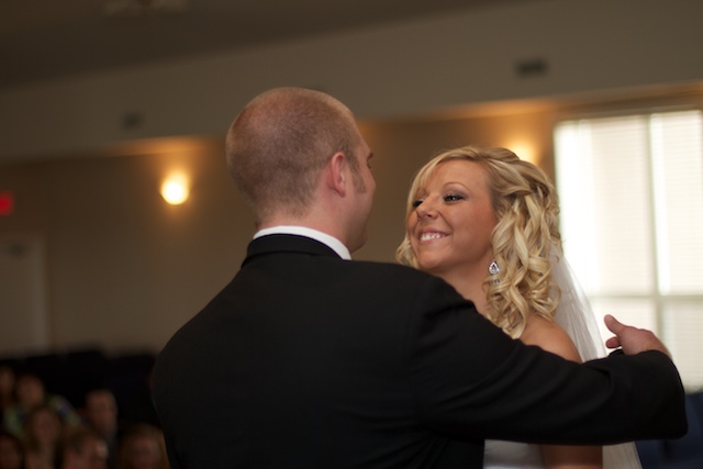
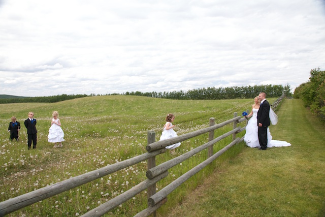
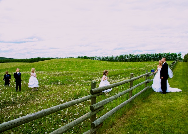
Hey all. My fiance and I recently shot a wedding for friends of ours. I'm looking for some C&C on a few choice images. Please don't be one of those "I don't like them" people. If you don't like them, please say why and what you think could have been done better. I've done some light edits on a couple, but by no means are these final copies, so if you have editing comments, please let me know as well!

Thanks!

#1


#2


#3


#4


#5


#6


#7


#8


#9


#10


Last edited:
If you number your pictures it is a lot easier to comment on them. :)

but...

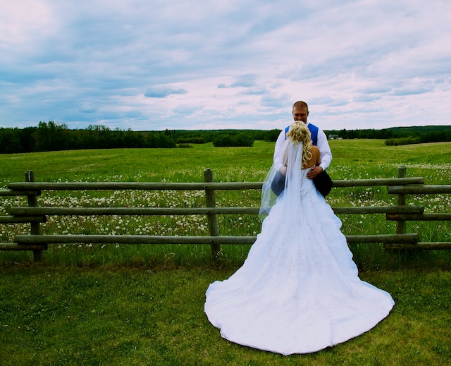
Picture #7 - I love the picture of the dress. I could do without the groom in this one though. And have her maybe turning to look over her shoulder, or down the fence line so you just get her facial profile.
(I must have re-worded that sentence 10 times!!! haha I hope that you can figure out what I mean there...)
Or maybe if you had her put her arms up around his neck I would have liked it more..

Maybe I'll comment on some others if you number them... ;)
 
Thanks :) I went back and numbered them. Sorry about that.

I realized after the fact that I didn't get near enough shots of the bride by herself. I do have a few of her by the fence by herself, and I think I can see what you mean about the arms being around the neck. That would have been a good shot to do. I'll add it to the checklist for next time
 
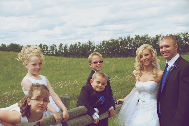
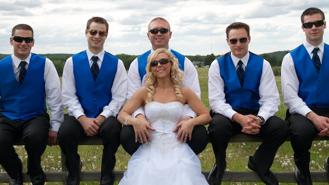
First and second shots, nice, but bad cropping. Fill the frame with your subject. Focus, lock focus and reframe, or offset your focus point so that you can have the subjects nicer in frame.. too much wasted space.
Third fourth and fifth, same, but not as noticable.
Sixth - BAD crop. chopped boys off. nice image otherwise.. take a step backwards, or zoom out (not sure of your lens in use), and don't chop peoples arms off totally, or feet.
7th.. nice idea... try tucking brides head off centre so as not to obscure grooms head.. have them look at each other with slight tilts, would have rocked this photo... or change angle yourself, so the fence leads either in to, or out from the bride and groom... could have done this by taking three or four steps left or right...
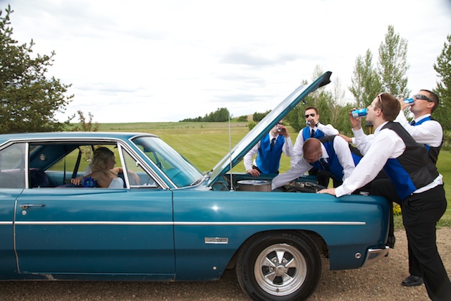
8th again, cropping just a little too tight.. crop loose in camera, and you can always crop tighter in post processing...
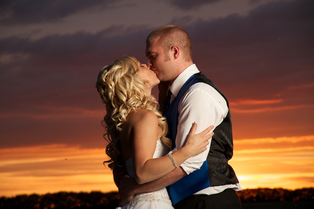
9th AWESOME ! My favourite for sure..... well done ! :)
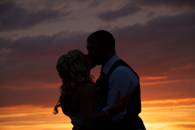
10th. nice sillhouette... well done.

Well done on your first wedding..

Cheers
Rich.
Wedding Photography Newcastle, Portrait Photography Newcastle.
 
1 is awkward... there's too much space abover her head. We can see the tip of the flowers in it... I think if you would've gotten them in the picture and cut of the top it would've made more of an impact...
I like the colors in #4 but I wish they would have been closer so you could see them more...
I agree with Rebekah about 7... The groom distracts from this one... she should've definitely looked down the fence and it would've made it awesome! But its a good picture!
8 is a cute concept but again I wish it were closer because it feels a little disconnected... and
with 9 I like it! Wonderful sunset!
 
First and second shots, nice, but bad cropping. Fill the frame with your subject. Focus, lock focus and reframe, or offset your focus point so that you can have the subjects nicer in frame.. too much wasted space.

I agree. When I start editing, I will definitely crop them down and fill the frame a bit more. The nice thing with the 7D is that I can crop down without losing too much image quality. There's also some vignetting in the 1st one in the top corners that I'll be cropping out.


Sixth - BAD crop. chopped boys off. nice image otherwise.. take a step backwards, or zoom out (not sure of your lens in use), and don't chop peoples arms off totally, or feet.

I actually didnt realize I had posted this one. I took one right after this one without the arms cut off.


7th.. nice idea... try tucking brides head off centre so as not to obscure grooms head.. have them look at each other with slight tilts, would have rocked this photo... or change angle yourself, so the fence leads either in to, or out from the bride and groom... could have done this by taking three or four steps left or right...

I was kind of unsure of this 'pose' at the time, because I didn't want to look like he was "dominating" her or more important by having him higher up. The shot just kind of happened after we kicked the groomsmen off the fence.


1 is awkward... there's too much space abover her head. We can see the tip of the flowers in it... I think if you would've gotten them in the picture and cut of the top it would've made more of an impact...

Hopefully a few more people will mention this, 'cause then it'll really stick with me for next time :P


I like the colors in #4 but I wish they would have been closer so you could see them more...

Working with the kids was really special. The mosquitoes were unbelievable that day. You can see how bad they are in 9 and 10. That's going to be a pain to get the big ones out of the picture.


with 9 I like it! Wonderful sunset!

Yeah, we totally lucked out. Later in the evening it got even more incredible with some awesome purples, but I didn't want to bring them back out away from the party, as it was already in full swing.

Thanks for the tips guys!
 
Too many different kinds of processing. Keep them simple and consistent!
 
Too many different kinds of processing. Keep them simple and consistent!

What would you suggest? For wedding I was thinking: B&W, Soft-Focus, Selective Coloring, and then maybe one more - like a vintage look or something like a cross process to make the colors pop.
 
You have a case or horizontalitis too. I would try to get some verticals. Im assuming for the horizontal shots of the sunset you wanted that lighting so thats a pass but wheres the vertical shots. Other than the one I saw which I think has a bit too much deadspace. I think its nice to offer variety if your doing it prior to the wedding. Get a feel for what sort of style the bride&groom are looking fore. Try to keep it consistent on the day for the set I think is very important. Or offering a set of color and b&w's but don't go for the whole caboodle. It might be my monitor but the focus looks a bit soft. Have these all been sharpened?
 
You have a case or horizontalitis too. I would try to get some verticals. Im assuming for the horizontal shots of the sunset you wanted that lighting so thats a pass but wheres the vertical shots. Other than the one I saw which I think has a bit too much deadspace. I think its nice to offer variety if your doing it prior to the wedding. Get a feel for what sort of style the bride&groom are looking fore. Try to keep it consistent on the day for the set I think is very important. Or offering a set of color and b&w's but don't go for the whole caboodle. It might be my monitor but the focus looks a bit soft. Have these all been sharpened?

Good point about the verticals. I do have a decent number of verticals, but its something that I'll definitely keep in mind.
None of them have been sharpened yet. There's been very little editing done, minus a few presets in Aperture (just to get a feel for what could/will be eventually done).
 
IMHO, selective coloring is NEVER the answer..
 
i dont have much input but wow, #9 is the money shot!
 
You have a case or horizontalitis too. I would try to get some verticals. Im assuming for the horizontal shots of the sunset you wanted that lighting so thats a pass but wheres the vertical shots. Other than the one I saw which I think has a bit too much deadspace. I think its nice to offer variety if your doing it prior to the wedding. Get a feel for what sort of style the bride&groom are looking fore. Try to keep it consistent on the day for the set I think is very important. Or offering a set of color and b&w's but don't go for the whole caboodle. It might be my monitor but the focus looks a bit soft. Have these all been sharpened?

Good point about the verticals. I do have a decent number of verticals, but its something that I'll definitely keep in mind.
None of them have been sharpened yet. There's been very little editing done, minus a few presets in Aperture (just to get a feel for what could/will be eventually done).

Ah well that could be some of the softness I am seeing. I used to have a horrible case of the horizontalitis too. After a year here I am almost cured. :P
 
Great stuff for your first wedding! My comment aside from agreeing with what others have said is to pay more attention to your exposure. I usually shoot manual outside after taking a number of shots and paying close attention to my histogram. When you get a whole sky blown out, it's very difficult to control it in post processing without it looking artificial. I also agree with the poster that suggested that you keep it simple. Let the images stand on their own and keep the post processing subtle and consistent...especially for wedding photos. The last wedding I shot the mother of the bride says to me "Why aren't there any pictures of my sister?". "What...you never told me you HAD a sister!" Lessons learned eh?

Steve
 
Welcome to the forum, Oilers do indeed rock! :D

I'll probably repeat a bunch of what has been said already...but oh well.

#1: Yes, too much room above while missing stuff below. It's a bad habit to fall into. Your 7D has a great AF system, so you don't have to use the centre AF points all the time.

#2: No bad. I'd crop this one right in. The only good/important parts are her & his faces...the rest is just useless space.

#3: Not sure where you're going with this one. Looks like a snapshot between poses or something. The horizon is in the middle, which feel bland.

#4: The grass is nicer but the sky looks pink.

#5: Cropped to close to the groom. Kids heads are stacked. When posing a group, think of triangles, not lines. In other words, never have someone's face right above another when you can have them staggered. Also, there is a lot of space between the 'groups'. Try to space out the people in a group photo, so that their faces create a nice composition within the frame. I'm sure it was easier said than done, as the kids were probably running around, acting like kids. It's a tough racquet being a wedding photographer :)

#6: Nice pose, cropped too tight. Also, as with some of the others...the sky is just too bright. It's a tough situation because if you expose for the sky, everything else gets too dark. In this situation, I would still try to expose for the sky, even underexpose it to make it look dramatic...but then use flash to light up the subjects. I would probably require a lot of flash power though.

#7: Sky looks much better here. I'm not sure if you shot it that way, or just edited it that way. The groom is too dark, the dress is too bright (and blue). Like I said, wedding photography isn't easy.

#8: Nice fun shot (did you think of that?). But it's cropped a bit too tight and the angle could have been better or more creative. I'd like to be able to seek the bride's face (with proper exposure) in the shot.

#9: Best shot of the bunch...by far. Not only did you expose for the great sky...but you lit them up really well...with off camera lighting. You should have been shooting like this for all the shots. :thumbsup:

#10: These are always nice. I might have tried to get a bit higher, to include more of the colorful sky...rather than the dark clouds. Could also try this one in a vertical and/or cropped closer.

 

Create an account or login to comment

You must be a member in order to leave a comment

Create account

Create an account on our community. It's easy!
Log in

Already have an account? Log in here.

New Topics

Back
Top Bottom