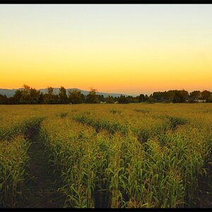
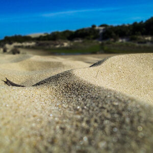
#2 I love - the shallow DOF works for me, the colors are great, no noise, etc..
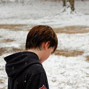
#1 has distracting bright lines in it, really hurts the image. Looks like rope or something to tie the rosebush to something for support.
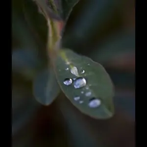
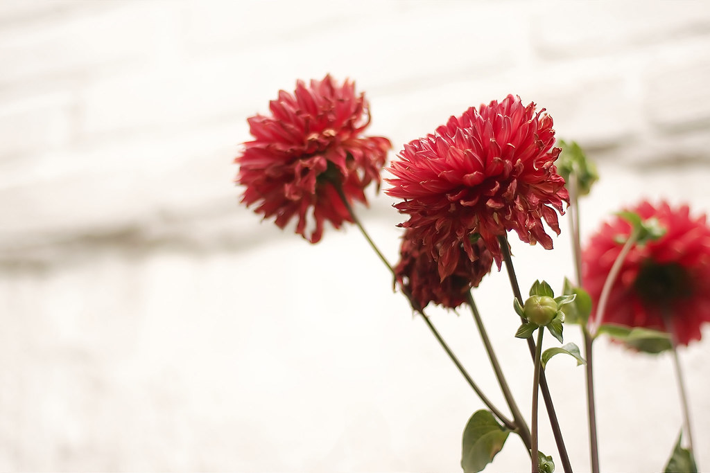
#3 is ok, but the white background is meh. Also the flower in focus blends into the one behind it which it out of focus - something I always notice on my own pics only when I open it up on the computer screen.







![[No title]](/data/xfmg/thumbnail/40/40298-08fb67b2f2c98625b8ff8dcb00ed42a8.jpg?1734174708)