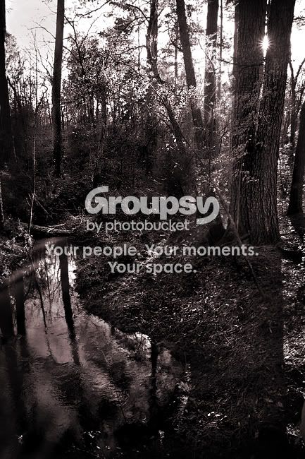
Very pleasing composition all in all, and the sun star peeking through the trees is the "dot on the i" as we would say in German, or "the cream on top".
But I am not too happy with the toning, myself. I find it too far in the way of red/pink ... that is personal thought: I'd possibly through a bit more yellow into the equation... maybe.
thanks everyone! I appreciate what you had to say Lafoto, it might be a tad too pinkish. might be a monitor issue also. I was going more for the traditional copper tone look from film, I may have overdone it though. I'm not really a big fan of the standard yellowy sepia. good tip though, thanks!




![[No title]](/data/xfmg/thumbnail/40/40305-2fbdc00adce4fac5e62dccb3f6f9c633.jpg?1734174713)



![[No title]](/data/xfmg/thumbnail/40/40309-c759bfd4ae7c079632e7402d21d332f1.jpg?1734174717)