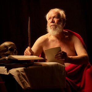
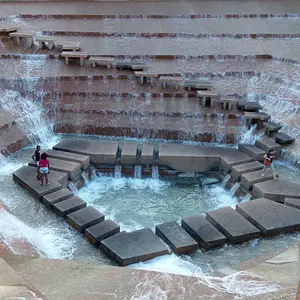
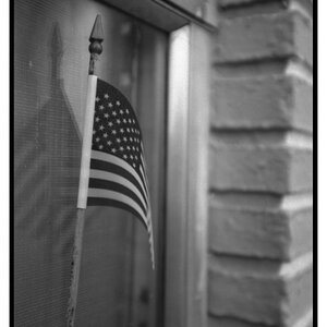
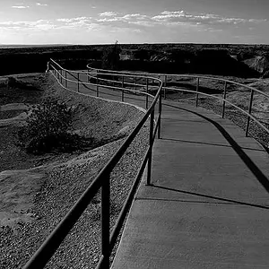
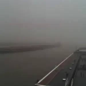
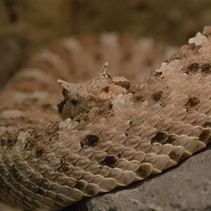
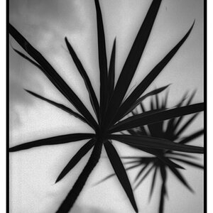
I really like the first one, I think if it was maybe rotated horizontal and maybe cropped a little closer it could add something to it though. I did it on my cpu and like it alot if you don't mind I will post it.
#1: Need more contrast to me - too many similar shades and not enough 'stands out'.
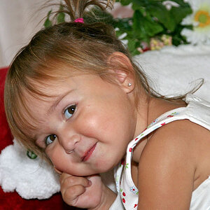
#2: Like the duck - great sharpness of the duck features - would suggest trying to shoot with a little different lighting. I would like to see more lighting on the side of the duck that we are looking at in the picture
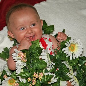
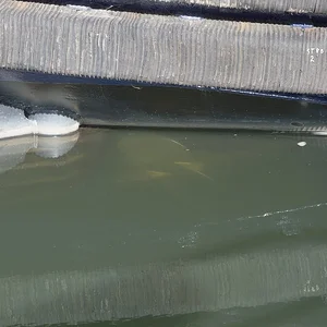
#3: I feel like the focus was a bit missed here because my eyes aren't able to find a place to focus on and I keep roaming around the picture to find the focal point.
As for #2, now whole lot I can do about that one. I don't have any form of good lighting yet, and that's in the mail. =) I think the on board would have been way to harsh for what I was doing there. Plus, I thought I would have a little bit of PP and see what kind of fun I could have. Hehe.
Originally:
#3, oh, well. Hehe. Not whole lot I could do there, PP, unless someone has an idea.