#5 really strikes me.
To nit pick, I think her shirt sleeve blends into the tree a wee bit to closely and starts to ge lost.
#1 is nice. But I could see her being higher in the frame, with more of the railing to give more feeling of height, or teasing inaccessibility.
1,5,7 and 10 have the best story telling going on. The others feel more posy.

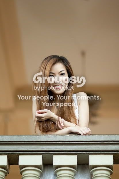
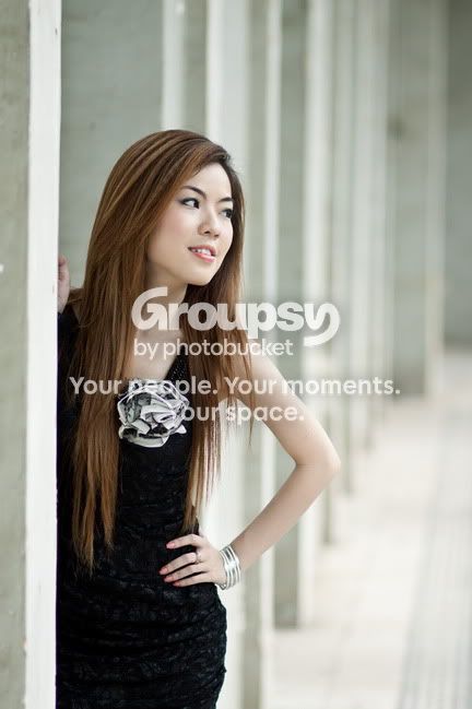
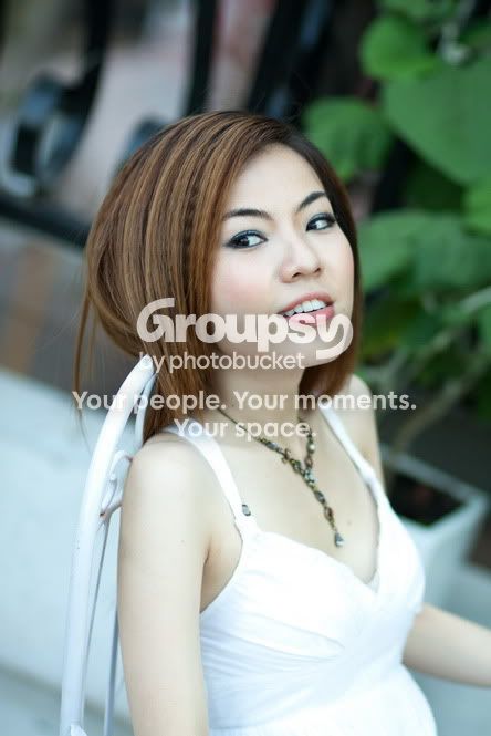
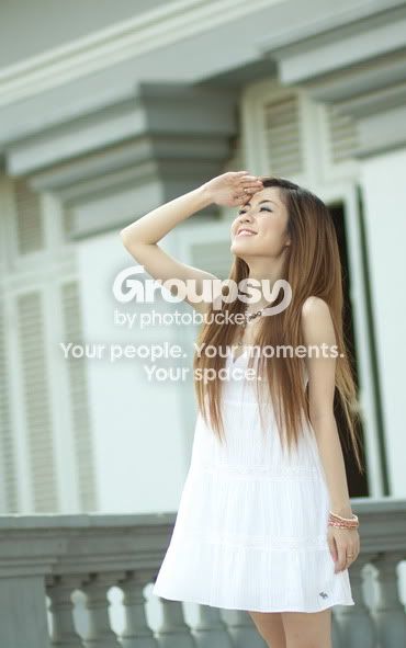
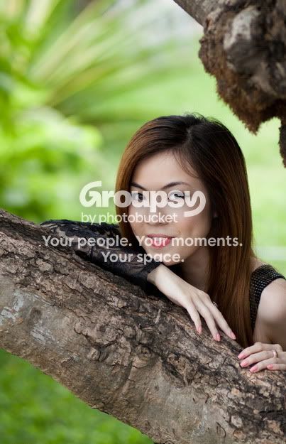

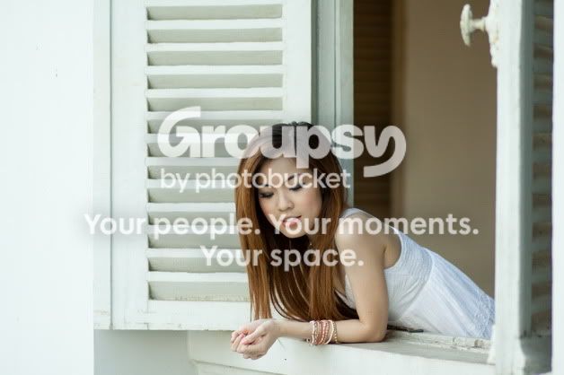
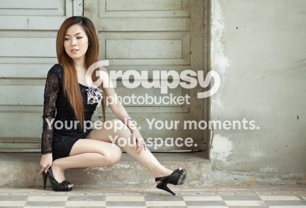
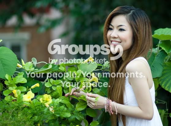
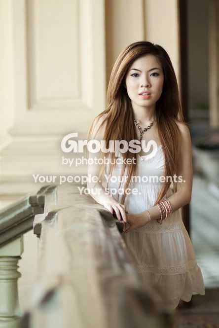
 The surroundings are beautiful and bright, and your subject pops in each photo!