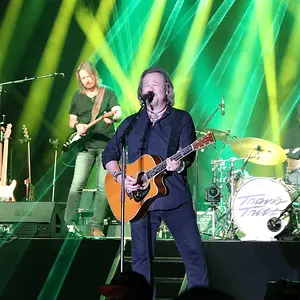
I like the contrast here but because you posted it in critique thread, I'll critique it a bit

those two guys in the background are a bit ditracting
and I'd lower the angle a bit, because it is annoying that I don't see the bottom part of the bridge. I think that by lowering the angle you'd loose the empty space in the top-right corner. but it's only my humble opinion