What's new

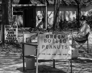
Green Boiled Peanuts

ceeboy14

TPF Noob!
Joined
Dec 5, 2012
Messages
2,566
Reaction score
788
Location
Florida
Can others edit my Photos
Photos OK to edit
$8563459346_03c706c47b_o.webp
 
Yah know, I'm really getting tired of saying it today, so I'll just give you 2 :thumbup:
 
I think composition is lacking here.
There are three things asking for attention and you aren't giving any hints where the viewer's eye should sit.
The sign in the front is prominent but boring with arrows that point to the side.
The sign on the left is bold but doesn't give any more information or have any interest.

The man should probably be the main center of interest but he is off to the side and close to the edge.
If the picture had been of the man more prominently with the signs as supporting elements then it would be more of a character study with the signs giving hints about him

As it is, it's incoherent, and making it b&w doesn't add gravitas
 
Well, CB, it just goes to show you shouldn't listen to me. I actually enjoyed it. Lew didn't and that's ok.
 
And I hate boiled peanuts. that aside nice try
 
Oh well, Lew isn't the last word in critiquing, though he does make good points about a lot of stuff...I deliberately set the shot up so the old guy was looking off over my shoulder and gavitated the interest more to the signs. Boiled peanuts are a southern delicacy and it seems there is someone selling them on every corner during the summer. This guy is a bit early and his peanuts were terribly salty...kind of like him. It was shot with the sole intent of being B&W...just like my newest post.
 
I think composition is lacking here.

No, there isn't. the composition was made with the same intents you are criticising.

There are three things asking for attention and you aren't giving any hints where the viewer's eye should sit.

The sign in the front is prominent but boring with arrows that point to the side.

The arrows are pointing to the seller - the guy sitting ramrod straight, Forrest Gump style in his folding chair, but more importnatly, this badly stenciled sign is pointing a driver to a Boiled Peanut stand. It is the crudity of the sign, the portable gas bottle, the folding table which liends itself to Americana at its best.

The sign on the left is bold but doesn't give any more information or have any interest.

It is the very repetitiveness of the sign which to me makes it quite interesting. It is different from the first sign, in a sense, almost artistic given the artist who likely painted it. In a second sense, as with the first sign, helps to frame the seller, who to me wasn't as important as the setting itself, hence his position and his gaze - looking past me for that next sale.

The man should probably be the main center of interest but he is off to the side and close to the edge.

How can you possibly second guess what the main intent should be? Especially in this type of setting, but I guess this is so much a southern thing as to go past you in that sense. Some things, I guess are too regional, but even a lack of understanding shouldn't permeate a second guess to the intent of the artist. As a question, it would be an acceptable comment.

If the picture had been of the man more prominently with the signs as supporting elements then it would be more of a character study with the signs giving hints about him.

If I had wanted a picture of the man, don't you think I would have made such a statement? Hell, that would have been easy but I was more into capturing a piece of the rural south, hence the title, "Green Boiled Peanuts." Didn't say, "Crusty old man selling green boiled peanuts."

As it is, it's incoherent, and making it b&w doesn't add gravitas

It's perfectly coherent; it's just that you don't understand the language spoken: southern.

As to B&W not adding gravitas, as it a part of a series, "Country Roads," in which all of the images are B&W, nothing would be served by leaving it in color.
 
Oh, excuse me, my mistake.

I had assumed that you wanted viewers to look at your picture and actually think about whether it had some meaning for them.
And then to take the time to respond honestly.

I think perhaps that in the future, instead of just posting a picture by itself and leaving the viewers to puzzle out what is going on, you should accompany it with a text explaining why you composed it the way you did and what they should appreciate about it.

Those notes will be invaluable to the curators of your work when the museums of the future honor you with a retrospective.

I shall wait for the catalog of those events.
 
And we should all let what you say be the Gospel of the photoforum and let the world roll on by? Must be nice to sit so high. And, I should do what most others do not: post an explicit explanation of intent? Why? Do you?
 
I assumed you wanted honest responses but you seemed to be annoyed that you got exactly that.
I don't think that my opinions are 'the Gospel' but I do have them and you seem to be annoyed that am willing to express them.

Your explanation is understandable and unnecessary; the picture does have all those elements but, imo, it is badly composed.

My suggestion that you post a text about your intent was sarcasm.
 
I wasn't annoyerd in any way that I got an honest response. I was annoyed that you made unfounded assumptions about my intent or what you thought it should be. Had I wanted the image to be about the seller, it would have been. Basing the rest of my image on your assumptive belief the image should have been focused on the seller, in my opinion would serve no purpose other than to bias other possible opinions. Even Rick58 made a response accordingly. I will stand by the composition because it does convey my vision. You don't have to like it, and your comments are always welcome, but for me, a comment should be based on what's there, not what a viewer thinks should be there..otherwise, what's the point of shooting at all?

In most cases, I like your comments, in this case, I did not and gave reasonable reason as to why I did not. At this point, all we have to agree on is that we agree not to agree. :)
 

Create an account or login to comment

You must be a member in order to leave a comment

Create account

Create an account on our community. It's easy!

Log in

Already have an account? Log in here.

New Topics

Back
Top Bottom