HDR C&C Please

cereal83

TPF Noob!
Joined
Sep 4, 2008
Messages
46
Reaction score
0
Location
Ontario Canada
Can others edit my Photos
Photos OK to edit
1.
b69fb25f.jpg


2.
e7191320.jpg


3.
DonMillsBrokendownhouse.jpg


4.
de182d48.jpg


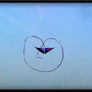
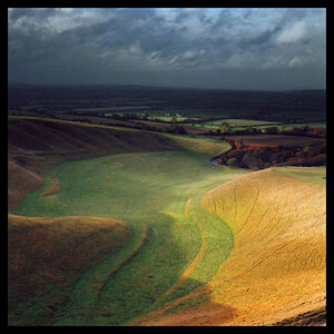
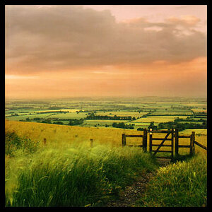
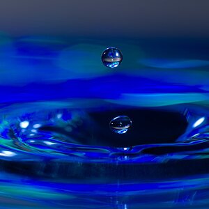
Random HDR shots I have taken in the last 2 months or so. I just love HDR despite a fake looking image or a real one. This is my work

Thanks all
 
#1 - The shadow on the side of the building is a bit distracting, but the overall picture itself is pretty good.

#2 - Seems like the flash is flooding the picture, or maybe it's just too much light -- maybe it would have been better to take that at a darker time in the day.

#3 - I don't really care for this one, seems like there's no real focus.

#4 - I think that picture could be much better and overall a great photo if you cut out more of the background to emphasize on the road / tall grass more.

This is just what I think, I'm not expert by any means, just my opinions.
 
I like the second one the most. I`m not sure if I like the chairs being there or not. Either way, it kinda tells a story.

I can see where Adunebutt is comming from, the top part seems to be darker. But I`m gonna have to disagree with him. Maybe its just the vigenetting?

What software did you use? I havn't tried HDR for a while, because tbh, I don't have a good subject. Maybe tomorrow I can try again.
 
is #3 a playground in the ghetto?

1 and 2 are my favs.

I wish i knew how to do HDR :(
 
1. Wonderful HDR without looking super fake. I'm in love with this one.

2. Too bright, although a great subject. I'd be interested to see something more come out of it in PS.

3. I agree with Adu- what's the actual focal point of this? It's pretty distracting to me.

4. Nice photo- but nothing really stands out to me- in fact the building seems out of place with the rest of the scene. Again I agree with Adu about focusing more on the roadway...
 
In #2 I find the boldness of the graffiti a little to distracting. The subject seems to be the chairs and the scene but that giant bold blue B just destroys the feeling for me. The affect otherwise is very nice in the scene.
 
Hey all,

Thanks for the comments.

Ok well I shoot alot of abandoned place so:

1 - Abandoned Slovak cathedral, I know the shadows take are distracting but it was the best angle I could find and i hate how I cut off the back of the church. I love the sky in it though.

2 - Abandoned house. I was taking this photo for a competition "Physical traces" and this is what I came up with. Yes outside the windows is overexposed as it was a super bright day but I think the chairs and that B make the picture. It shows it was once a house and what people do to them over time of being empty

3 - I like this photo because it is so busy. Its an abandoned Brickworks factory in Toronto. I was just trying to show with time, everything comes down.

4 - I love this photo. When I took it, it was about 7 pm so it was getting dark. This is a 1 image HDR and it was so dark. If you look close enough, you will see major noise as the original image is almost black and I had to bring up the exposure and brightness so high but making it the HDR kind of hid the noise at this size image. In the background in an abandoned boys jail that closed in 1970 near Sudbury Ontario. My title on Flickr is "The wrong path" as its the road to the jail. Sure I could have focused more on the roadway but I wanted to show more the jail then the road.

I used Photomatrix for all HDR images. I use Bridge to edit the photos but sometimes I go right into photoshop to edit like with #1 as it was too blue so I added a warming filter to the image and it made it a bit more yellow.

I appreciate the comments guys, I will take them away with me for next time I do shooting.

Any other questions, just ask.

Thanks
 
i like 1 the best, not sure if 2 and 3 are hdr type pics but still have a cool look to them
 
oh. i didnt mention the shadow of the first tower on the right one. i'm talking about the first picture btw.

how about trying it at a different time of day? the shadow is too distracting for me.

oh, im serious too. i wouldnt mind seeing one without the shadow o.o
 
different time of day would work for sure. Early morning maybe or on a really cloudy day. Thanks
 
I really like them all, especially #1 & #2. In #4 the only thing I would suggest is to cut more of the sky, it just seems like there is too much above the horizon. Perhaps just above where the sky goes from light orangeish to blue is a good reference point. It would help emphasize the road/jail.
 
I really like them all, especially #1 & #2. In #4 the only thing I would suggest is to cut more of the sky, it just seems like there is too much above the horizon. Perhaps just above where the sky goes from light orangeish to blue is a good reference point. It would help emphasize the road/jail.

Yeah I see your point, cutting it off there would make it look diff. I will try it when I get home and see what it looks like. Thanks

My favorite is #1.

Mine also, I think it's the best hdr I have done to date.
 
Yeah I see your point, cutting it off there would make it look diff. I will try it when I get home and see what it looks like. Thanks.

Post pics when you do? I'd really like to see how it effects the look/feel.
 

Most reactions

Back
Top