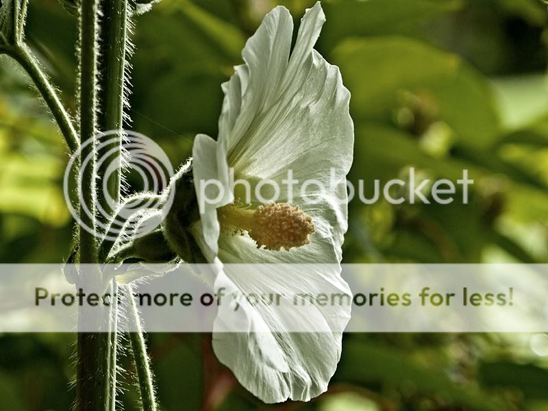
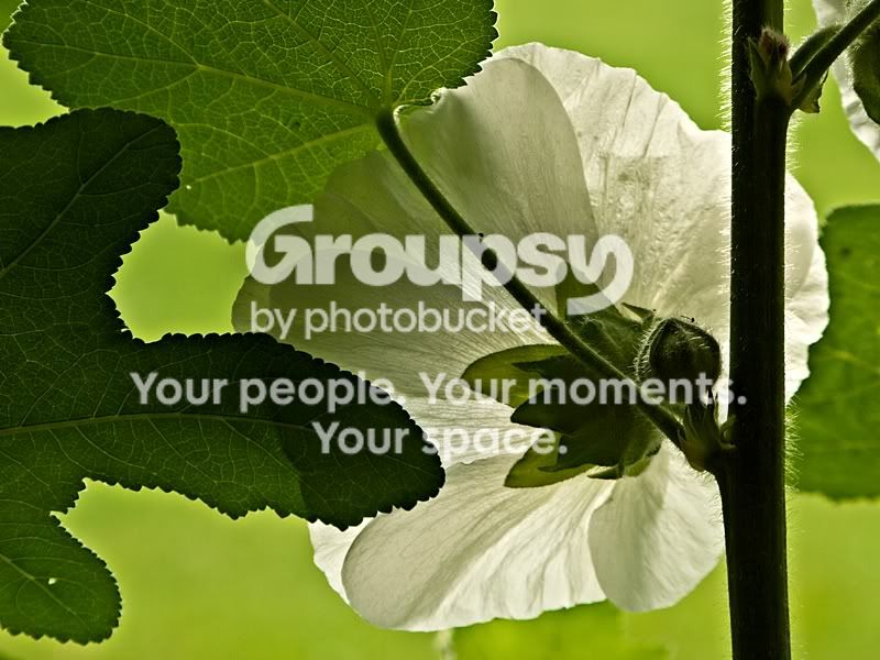
Absolutely lovely light in the first shot, Ron--marvelous light! I wish there was a bit more space at the top and bottom of the bloom though. THe shape and textures revelaed due to the light is outstanding. I wish the color balance were warmer though--that overall greenish look is a bit depressing.
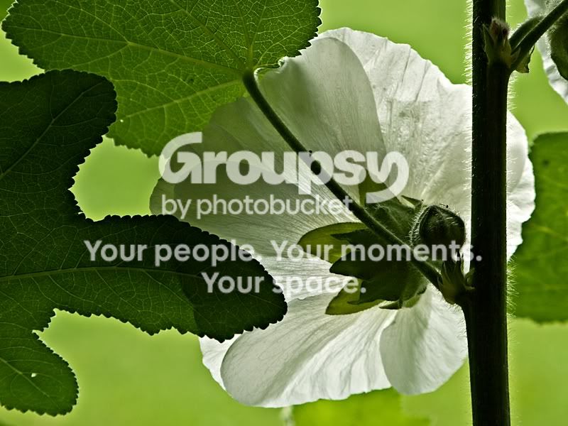
Shot 2 is a very strong, offbeat, novel point of view. It is subtle, not in-your-face, but shot #2 has a very satisfying feeling about it. The more I look at it, the better it becomes. Again, the white balance/color cast is not 100 percent to my liking, but I think this photo is very nice. This second photo usesthe compositional style called "as in a painting", where the subject touches at least three sides of the frame, in effect filling up the entire "canvas" with subject. This is a very,very good example of that type of composition. If you cloned out the two tiny holes in the leaves, I think you'd have a little bit more harmony within the frame. You know, the more I look at these paired up, the stronger I think they both look, but #2 is a real kick-a$$ shot in my book.
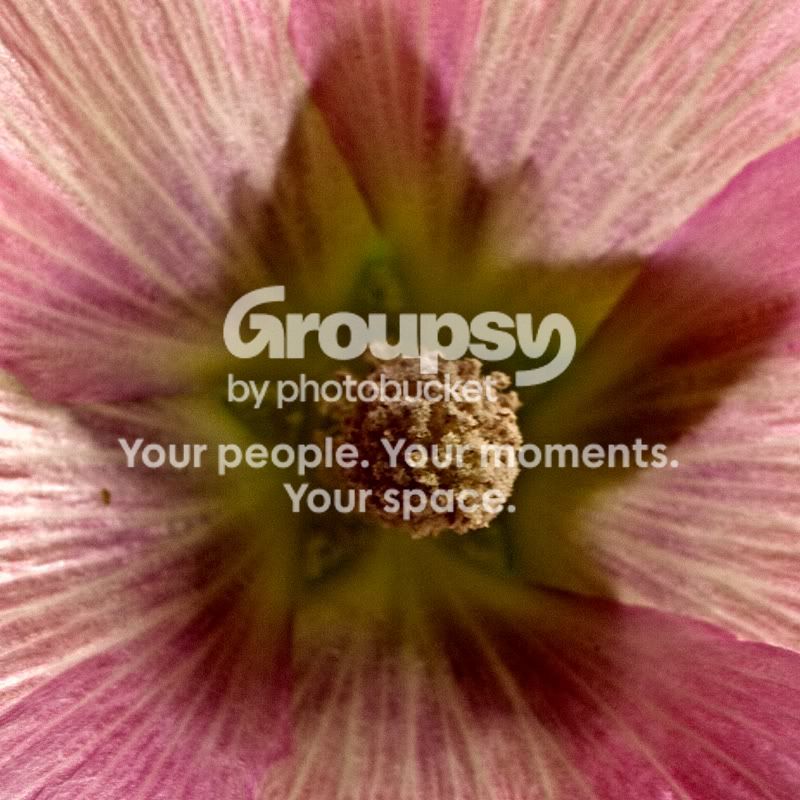
Shot 3 I simply go meh to. Still, you batted .667 or whatever...enough for a heck of a MLB contract!







![[No title]](/data/xfmg/thumbnail/34/34119-711b53445c011079fb89b6f42682ed00.jpg?1734164590)

![[No title]](/data/xfmg/thumbnail/41/41906-b9041eb5a3fa48eb5d5084ac2198a75c.jpg?1734176271)