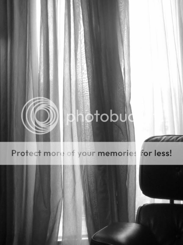
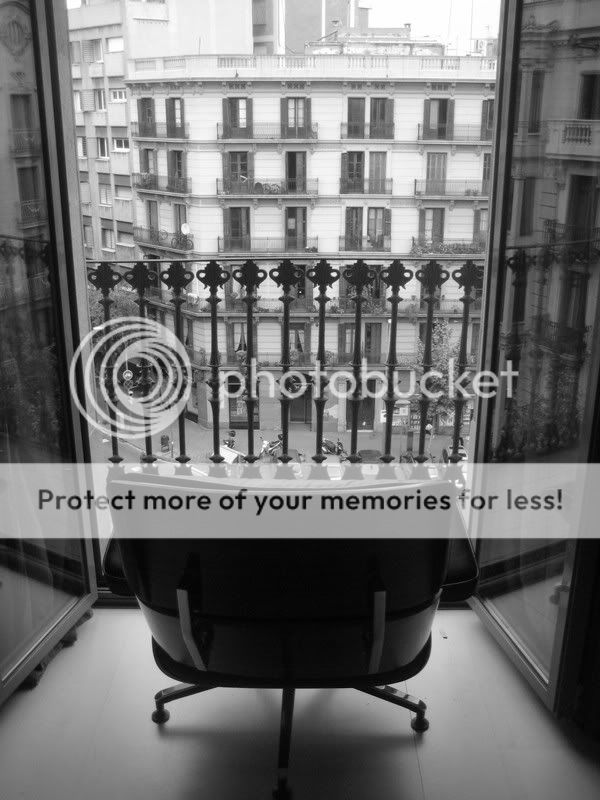
I like the first one in particular. The asymmetrical composition and the empty chair give it a nice quirky feel. The varying lines and depths of grey in the left curtain is interesting, and is well balanced by the white to the right and the part chair. It's an image for the eye to wander about and the mind to wonder about. The second shot, in comparison, tells me a lot but asks me little.
Do we know Kaymlo is not a pro?
Of the two I prefer the second and could sit there watching Barcelona go by. I understand what you wanted from the first (I think) but for me there is too much curtain/net and just maybe not enough chair.
1 is really boring. 2 on the other hand, i like how it feels like someone special is suppost to be sitting there, maybe like a gov. looking over the city. IDK
To me number 2 is a really great start that just needs a little 'flair'. I love the concept, and the view is perfect for a shot like that, but maybe try taking it from a lower perspecitve, so you're looking across the chair instead of down to it. Good stuff!
Man I love the Eames Lounge chair. I would kill for one! I do like #2, however I think it may just need some more post processing. Looking at it, I think some contrast in the window would help a little. This shot could have some really great tones.