How could I have taken this picture differently to make it less snapshotty?

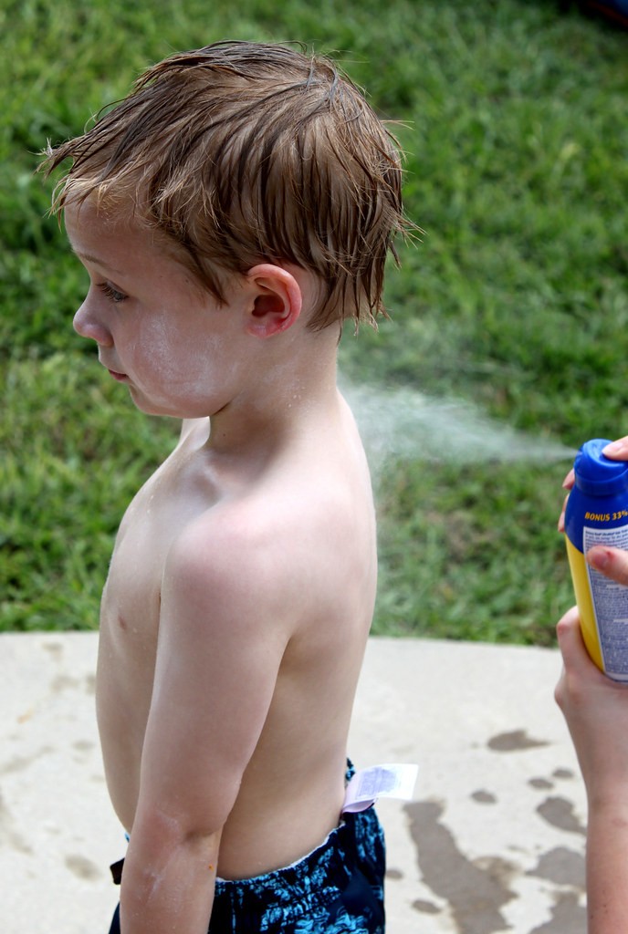
Okay, I gave a few of your suggestions a shot. I cropped it to a square which cut out the tag, and put back some of the space in front of the little dude. I think this is really the one!

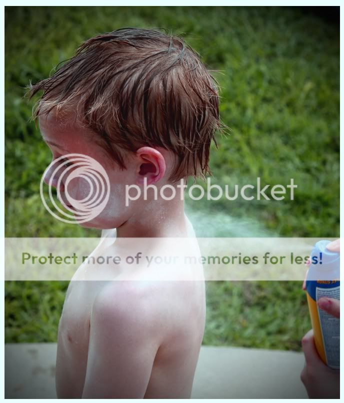
Okay, besides the joke, are the changes improvements or just changes? I added a tiny bit of noise in addition to turning it B&W. I can pull that back out if it's better without it. It looks like more noise than I put in now that it's uploaded. Maybe when I saved it as a jpeg... hmm.

Anyway, let me know what works and what doesn't.

4660343361_bc3beea457_b.jpg
 
Also, when I turned it B&W, I made the reds a little brighter, and the greens a little darker to help him stand out. I didn't touch the other colors. Are there other combinations that would have done this better?
 
Danksalot said:

Okay...the snapshot ethos is what this photo is all about. The photo as shown above has some very interesting stuff going on. The kid is wearing swim trunks, with the tag sticking out. His hair is wet. The concrete patio or whatever is wet, so cropping out the tag of the swim trunks and the patio basically ruins the photo. The right edge of the photo has the hands of a woman, holding the can of very modern spray-on aerosol sunscreen. This photo has a minimum of negative space for the kid to look into, but then again, that forces the eye to look at the spray stream of sunscreen being applied. This photo is "about" the snapshot ethos. You said you like the photo as it was. I'm not sure if you understood the reference to Eggleston's work.

It certainly would not be appropriate to do a type overlay on a B&W cropped,square conversion of the shot as seen above. If the original shot had been included in an Eggleston show in a gallery, you'd have people standing around, admiring and analyzing the cr@P out of the photo as shown above. The B&W, cropped version that eliminates the swim trunks, the tag, and the water splotches on the concrete totally ruins the shot.
 
Thanks for the feedback. The original picture is about being uncomfortable, so I like some of the things that people suggested I should change. That being said, it never hurts to take suggestions and see what comes of it. I kind of like both versions.

Now that you say it, though, I did feel like the spray was as much the subject as the boy when I took the picture. Thanks for your take on this photo, I really appreciate it. I think you put into words what I like about the photo, and that helps me to like it more.

Yeah, the type overlay was a joke, and the Ghostbusters "O" was just the icing on the cake.
 
I thought it would be cool to see it from the sprayers view point. Like, get behind the spray gun and focus on the head of the spray gun. Have the DOF just shallow enough where a bit of the mist is in focus and you can still make out that it is a boy. Just a different perspective.
 
I agree with Derrel that the edit went in a wrong direction. To add to his comments, the spray residue is no longer visible on his face and neck. That was a key part of the original.

My original comment about spraying the kid in the face was serious. The point was to have some intent or thought process. Deleting imperfections in this kind of image deletes any interest, cause there' nothing else to look at really. So scrap this image and reshoot with a clear intention.
 
I think I have to dissagree. The focus is noe on the childs face and his expression, Which is cute as a button by the way. I like the edit....except for the noise.
 
In addition to shooting from the kid's level, I think standing back and shooting horizontally to include the person spraying is important. I feel like there is a great moment here and I'm only getting half the story. I wonder what the other person's expression is.
 
Thanks for all the great responses. I was thinking about the kid's experience, and he was thinking about getting back in the water. His mindset didn't include the sprayer, so neither did I when I took the picture.
 

Most reactions

New Topics

Back
Top