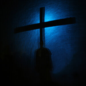
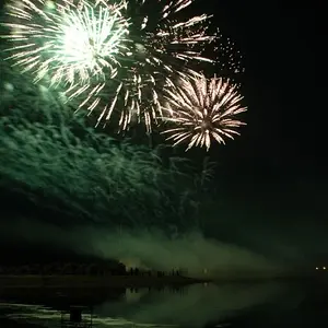
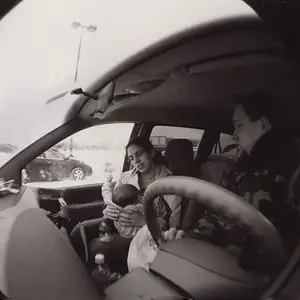
What's black, what's white, and the range of grays in between is called contrast. There are a lot of different ways to control it from lighting and exposure to processing.
All processing software is going to have some buttons/sliders/tools labeled "contrast", but often the best tools for contrast adjustment have some other name for instance "levels" and "curves".
You might start out with levels (I think it's under Image>Adjustment>Levels in PS). Levels shows you the histogram (a bar graph of the tonal range in the photo) and allows you to adjust the black point, white point, and middle gray points. If you look at the levels of one of your "gray-ish" photos you will see that the histogram may not extend all the way to the ends of the scale. Sliding the little white and black triangles until they are at the edges of the histogram (makes the darkest gray black and the lightest gray white) will probably perk up the photo.
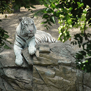
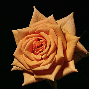
Curves is similar, but you get more adjustment control. With curves you can adjust black and white, and then brighten highlight grays and darken shadow grays (creating an S shaped curve) if you want lots of contrast like the photo above.
You should be able to find plenty of levels and curves tutorials. Get in and fiddle; it's easy enough to see what's going on with your eyes.
With both film and digital it is almost always easier to increase contrast in processing than to decrease it, so I prefer to start out with a lower contrast raw file or neg. As usual the best practice is to try and get it as close as possible at the time of exposure, but that may require control over lighting, and that's not always an option.




![[No title]](/data/xfmg/thumbnail/37/37642-b84a3ab0bc05ccd30092514e185e7c01.jpg?1734170765)