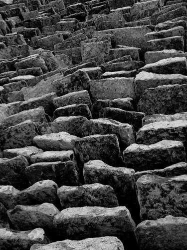
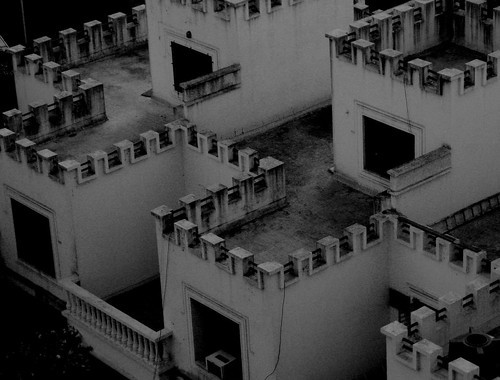
The third is nicely abstract and has a good many tones, while the fourth, also pleasingly composed, is very grey and little contrasty. And that while the shapes and geometric strickness of the photo suggest strong contrasts, too. Maybe upon composing the last, you should have paid attention to that highest up roof towards the top left and either get ALL of it into your frame, too, or none of it.
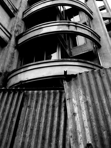
The same thought I'm having about that balcony (?) bow in the second photo. Top bow either all in or all out.
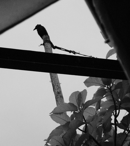
The first photo doesn't speak to me...





![[No title]](/data/xfmg/thumbnail/36/36663-6033a8e60c3aec9731283de0f7f2aafb.jpg?1734169171)
![[No title]](/data/xfmg/thumbnail/36/36662-242aa39f5cb3a23494857864779f669b.jpg?1734169171)
![[No title]](/data/xfmg/thumbnail/36/36664-a1f71b488f6761523649a87f8465fc3d.jpg?1734169172)
![[No title]](/data/xfmg/thumbnail/36/36665-7c494bf98537fba5ac87ac5ad6bda658.jpg?1734169172)