What's new

I will c&c your work for you, beginners welcomed.

I appreciate you taking a look...what can I do to improve?
P8052765.jpg

good

-great light and time of day
-classic silhouette
-great comp (1/3 rule, sky vs water and dock placed off center)
-exposure is right on
-good DOF

nit

-to much clutter (the metal track in the FG, the pole beside the dock on
the left and sign in the far right bottom corner)

-photo has a tilt to the right when placed on a grid
-photo is a tad noisy (clouds)

tweak

-straightened the photo but not fully level as I will loose some of the crop

-added as tad of selective color boost and contrast boost to just
the clouds highlight colors and the reflection of colors in the water
in the bottom right corner

-lightened (dodge) the dock area
-healed out all the clutter

-added a tad of global contrast boost

-put the photo through NR software

Hope this helps and thanks for posting.

Take care,

Dwayne Oakes
p255611975-4.jpg
 
Last edited:
Wow, that healed stray branch on the rabbit. Saw that one coming but didn't imagine it would come out as good. Nice work.
 
I figured I'd throw one of mine in here...I'd be curious to see how it ranks. I don't have any kind of image editor other than DPP and I'm not all that experienced anyway so, I'm expecting heavy crit but that's fine. :)

3761264050_2f4d528026_b.jpg


Obviously it's OK to edit this one since I'm asking you to :) Thanks in advance!
 
Last edited:
This photo is directly out of the camera. Clearly it is underexposed but I know there is other work that needs to be done with it. I tried my hand at it and admittedly am not very skilled with photoshop yet so I would like to see what you do with it to get a better idea. Thanks in advance.
3826801596_fb0fddcc64_b.jpg
 
I guess I'd like to know how this shot could be improved. I took this shot today and don't own photoshop (yet).

IMG_0627.jpg


Thanks!

good

-great ISO performance @ 1600
-very good comp (vertical)
-exposure is right on
-good DOF
-good colors and contrast

nit

-WB is a tad on the cool side (blue color cast) personal choice
-poles have a slight tilt to left when place on a grid
-dark shadows in the trees on the right

tweak

-straightened the photo
-set the WB a tad warmer to remove the blue color cast (personal choice)

-used (selection gradient tool) in Nikon NX2, it is kind of like a digital
ND filter and selected just the top 1/3 of the photo, using the levels
sliders I darkened just that area of the photo a tad to cut through
the haze

-lightened (dodge) the shadows in the forest on the right
-added selective color boost to just the red dots on the lift chairs

-lightened (dodge) some of the tree tops in the photo
-added a tad of global contrast boost

-added a tad of USM (sharpening) to get over the AA filter
-healed out the number on top of the pole

Hope this helps and thanks for posting.

Take care,

Dwayne Oakes

p917246537.jpg
 
This is a friend of mine, I've been shooting cable wake boarding for a while but just need some new ideas and different perspectives on the post production of the images

23k3yao.jpg

good

-great freeze action
-exposure is right on
-color and contrast are good
-detail is very good

nit

-comp (to much RV and not enough subject)
-clutter on the grass (wooded parking posts)

tweak

-straightened the photo (grass line)

-cropped the photo so subject is to 1/3 rule and cropped the
photo tighter to get rid of some of the RV but still show
good height

-added selective (gaussian blur) to just the RV to create some DOF

-darkened (burn) the RV a tad
-darkened (burn) the rim on the RV
-lightened (dodge) some of the water spray comming off the
back of the board

-added selective color desaturation to the RV's roof tail lights
-added selective color boost to the colors on the board and subject

-added selective USM (sharpening) to the board and subject
-healed out the clutter on the grass and turf patches on the grass

Hope this helps and thanks for posting

Take care,

Dwayne Oakes

p383674476-4.jpg
 
Last edited:
3819576226_671f4f1148.jpg


I think this shot is alright, but can definitely be improved.

Thanks for your time!
 
Wow Dwayne you cease to amaze me! Thanks a lot that actually really expanded my horizons lol and the pic came out great!
 
I figured I'd throw one of mine in here...I'd be curious to see how it ranks. I don't have any kind of image editor other than DPP and I'm not all that experienced anyway so, I'm expecting heavy crit but that's fine. :)

3761264050_2f4d528026_b.jpg


Obviously it's OK to edit this one since I'm asking you to :) Thanks in advance!

good

-very good portrait comp (vertical) just a tad to much on the top, also
to bad the glass is cut off but still a very good comp

-exposure is right on (good hightlight control)
-very good DOF
-good detail

nit

-orange color cast (white balance)
-photo is noisy
-the lighter areas in the background are a bit of a distraction

tweak

-cropped a little off the top of the photo

-desaturated the colors (personal choice) this will get rid of the orange
color cast

-moved highlight slider over to the left in the histogram to improve
highlights and exposure this is needed after a desaturation or the photo
will look dull

-darkened (burn) the background so the lighter areas are not as much
of a distraction

-lightened (dodge) the eyes
-lightened (dodge) the ice cubes
-lightened (dodge) the candle lights in the DOF
-lightened (dodge) the highlights in the hair
-lightened (dodge) the shadows on the right side of the face

-added selective color saturation to just the yellow rose
-used selective WB (white balance) to warm the skin tones

-put the photo through NR software to get rid of the noise, this will
also add a soft-focus effect to the photo

Hope this helps and thanks for posting.

Take care,

Dwayne Oakes

p1015382342.jpg
 
Last edited:
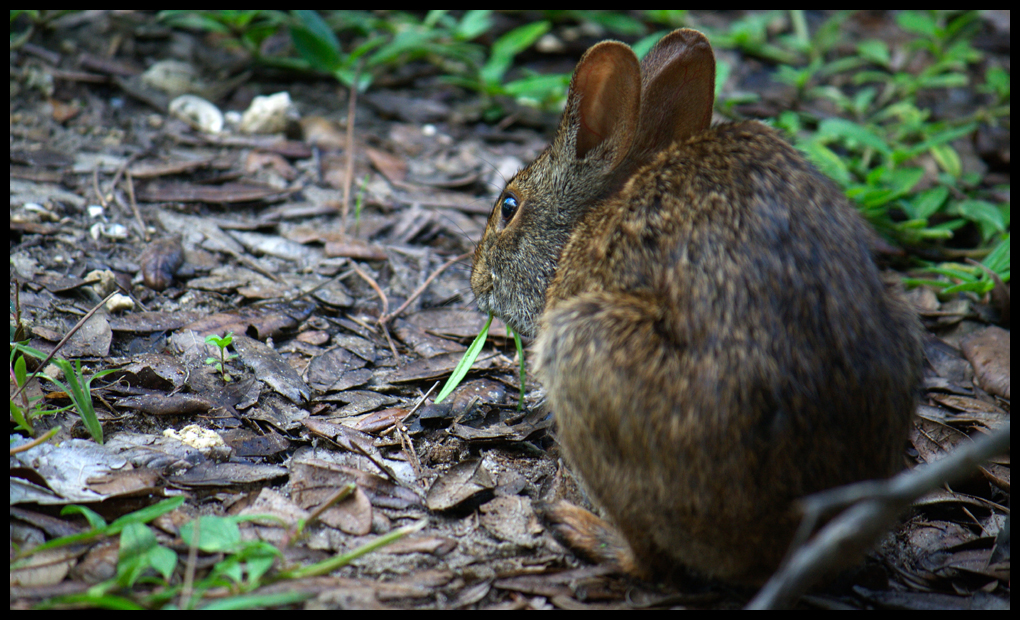
3784498099_d4bafb7e0f_o.jpg


just curious what you'd do with something like this:

good

-very good off center comp (just a little to wide and tight at the top and
bottom of the frame)

-great colors and contrast
-detail is very good at focus point
-exposure is right on

nit

-WB (white balance) is a tad on the cool side (personal choice)
-stray branch in the bottom right corner is a bit of a distraction
-comp is a bit wide (to much negative space)
-shallow DOF

tweak

-set WB a tad warmer (to get rid of some of the blue color cast) personal
choice

-lightened (dodge) the light coming through the left ear
-lightened (dodge) the fur on the back were the light is falling

-added a tad of selective USM (sharpening) to the just eye area

-healed out the stray branch in the bottom right corner and some
of the stray grass in the left side of photo

-no contrast or color boost needed

Hope this helps and thanks for posting.

Take care,

Dwayne Oakes

p628766934-3.jpg

wow nicely done with the branch. That was the only thing I would have changed... The only reason I wouldn't have changed the WB is because I was there and that's what they looked like... I really like what you've done though. Thanks.
 
I figured I'd throw one of mine in here...I'd be curious to see how it ranks. I don't have any kind of image editor other than DPP and I'm not all that experienced anyway so, I'm expecting heavy crit but that's fine. :)

3761264050_2f4d528026_b.jpg


Obviously it's OK to edit this one since I'm asking you to :) Thanks in advance!

good

-very good portrait comp (vertical) just a tad to much on the top, also
to bad the glass is cut off but still a very good comp

-exposure is right on (good hightlight control)
-very good DOF
-good detail

nit

-orange color cast (white balance)
-photo is noisy
-the lighter areas in the background are a bit of a distraction

tweak

-cropped a little off the top of the photo

-desaturated the colors (personal choice) this will get rid of the orange
color cast

-moved highlight slider over to the left in the histogram to improve
highlights and exposure this is needed after a desaturation or the photo
will look dull

-darkened (burn) the background so the lighter areas are not as much
of a distraction

-lightened (dodge) the eyes
-lightened (dodge) the ice cubes
-lightened (dodge) the candle lights in the DOF
-lightened (dodge) the highlights in the hair
-lightened (dodge) the shadows on the right side of the face

-added selective color saturation to just the yellow rose
-used selective WB (white balance) to warm the skin tones

-put the photo through NR software to get rid of the noise, this will
also add a soft-focus effect to the photo

Hope this helps and thanks for posting.

Take care,

Dwayne Oakes

p243894855-4.jpg

Well, I like what you did with the eyes! I'm not exactly sure why that much noise made it through the conversion process, both levels of NR were set to "High" and applied when I processed the image. Thanks though, this makes it look a lot better (the soft-focus). I like what you've done with it, with the exception of the color balance (see below):

As far as the white balance is concerned, it was pretty much dead on. I know you weren't there so it's not like you could know so I'm not complaining, I'm just explaining ^_^ The background was in fact that color because the sun was setting and coming through a very large window.

His skin tones were hard to get right because he had very very rosy cheeks, and a sort of 'orange' glow about the rest of his face, and some portions were very very pale and white. His hair was redder than in my picture. I wish I'd known a little bit more about my camera to get the full effect. He was quite an interesting character!

Thank you again for your C&C, I appreciate your time and effort.

Sincerely
-JFew
 
This photo is directly out of the camera. Clearly it is underexposed but I know there is other work that needs to be done with it. I tried my hand at it and admittedly am not very skilled with photoshop yet so I would like to see what you do with it to get a better idea. Thanks in advance.
3826801596_fb0fddcc64_b.jpg

good

-good comp (subject placed to 1/3 rule)
-good contrast
-good detail were the focus point is
-color is ok

nit

-subject is to dark
-photo is noisy

tweak

-lightened (dodge) the snake's head and body
-added a tad of color boost around the head

-put the photo through NR software
-added a tad of selective USM (sharpening) to just the snake's head

Hope this helps and thanks for posting.

Take care,

Dwayne Oakes

p959217682-2.jpg
 
Last edited:
Hope I'm not too late....


Create an account or login to comment

You must be a member in order to leave a comment

Create account

Create an account on our community. It's easy!

Log in

Already have an account? Log in here.

Back
Top Bottom