What's new

India so far... C+C Please

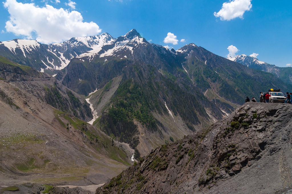
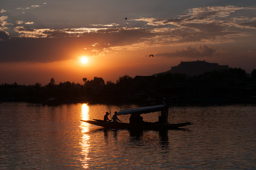
1: Amazing! Great use of the "people element"
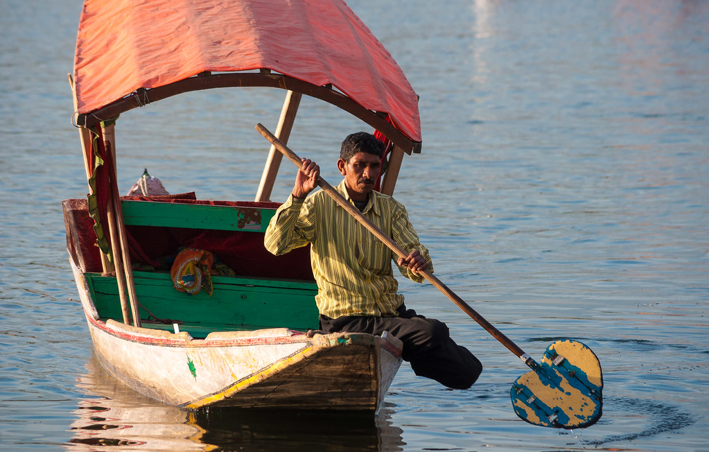
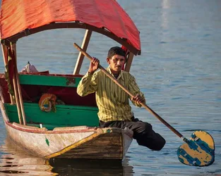
2: Nice! Maybe you should of zoomed out to get his reflection
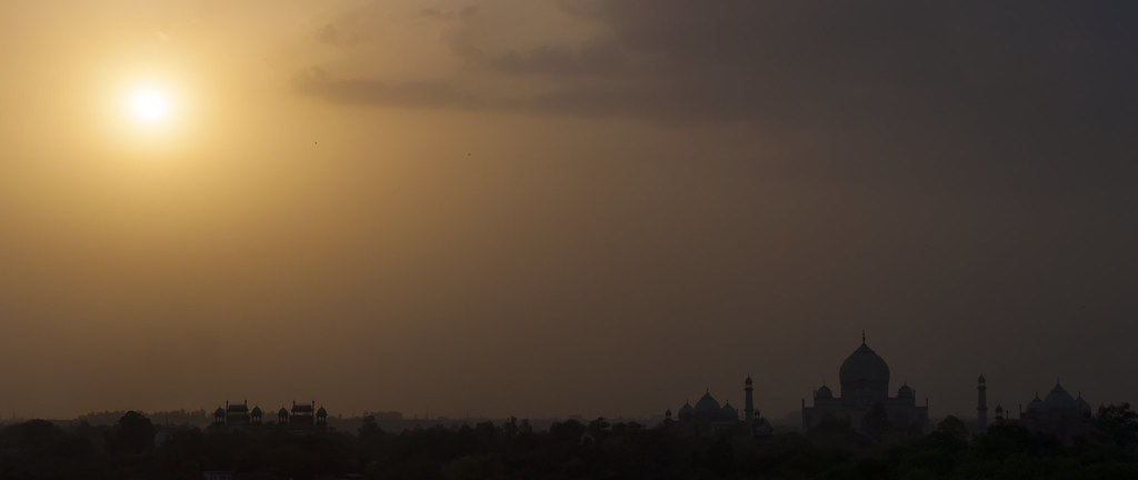
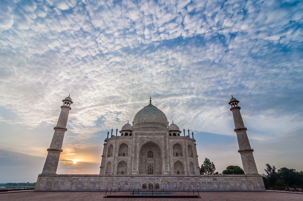
3:I don't think you should have taken the sun, it just draws away my attention to the building
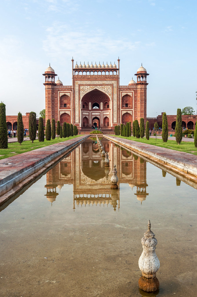
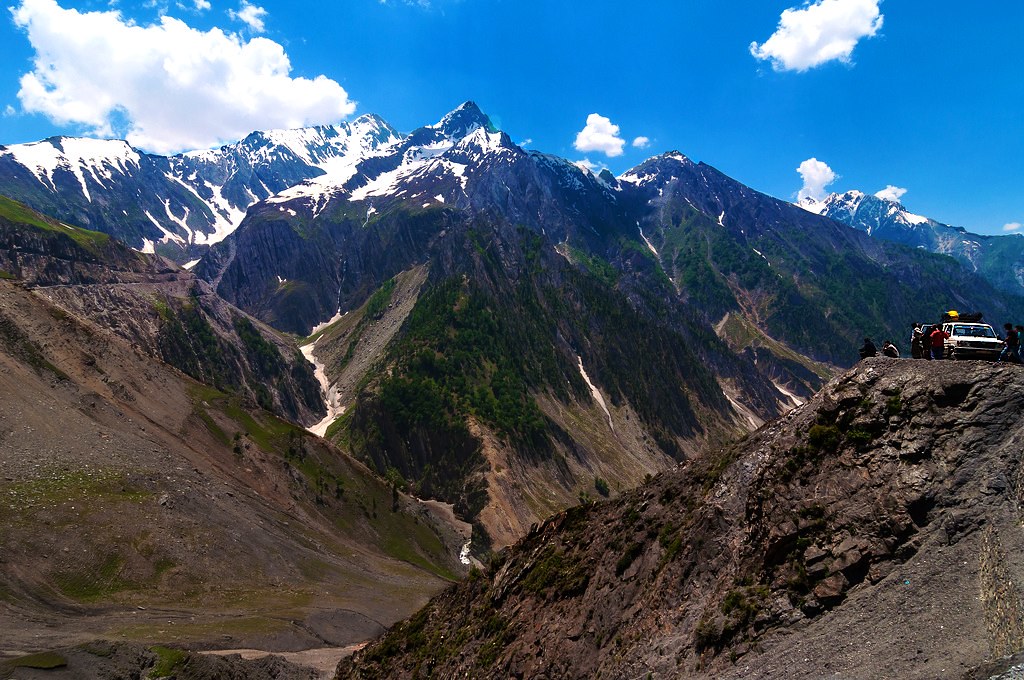
4: I can see that you were trying that Taj Mahal technique, but i think you should have made the horizon in the middle.
But great pics!
 
First of the first set is really outstanding!!!
In the third, even though the idea is great, execution could have been better? Taj is immersed in darkness
The latest images are superb ...and your new Taj is one of the best of that i have seen so far

Regards :D
 
Nicely done.
The man in the boat was done under semi-harsh lighting conditions and I think would be even better if you increased the saturation on the light areas and brightened some of the dark areas, giving some form to his face and to the side of teh boat.

$7506858126_ba0baee667_blllllllllll.webp
 
I love three. Perhaps dodging the lower right hand side a bit.

Was that a stitched panorama, or a crop from one image?
 
Frequency - I kind of like how dark Taj turned out, but I'm always open for ideas and always take criticism positively - how would you change it?

The_Traveler - I haven't really got the hang of doing localised editing just yet, but i understand what your saying. I like what you have done though, thank you - Ill be looking to get into that.

Jowensphoto - I guess the darkness hasn't really bothered me until now. Ill give it ago by dodging it and see what happens - i reckon you could be right. I did that with 2 photos and stitched it together with PTGui.

Thanks again for the look guys.
 
I am so jealous of you, I want to go to India so bad. #6 is my favorite, nice composition, and the majesty of the building itself. Very nice!
 
Hei, mcleish,

I too like how Taj jas been submerged into darkness and how the light gradient .... i just wanted that gradient to be a bit more brighter all over keeping Taj silhouetted

It is lovely even now ;)

I attempted something but not without much success
It reveals many unwanted evils too :grumpy:

Regards :D

 
I think 1 and 3 were my favorites. 1, I think, was very mildly overexposed, which killed some of the saturation and contrast. Here's an edit I did with a couple different selectively applied curves adjustments. It was a fine balance keeping the mountains from being a bit flat, but still holding the atmospherics that give the picture its sense of depth.


7506830376_c6f64c4627_b by franklinrabon, on Flickr

Not a final say or anything, just my thoughts on a sort of "ansel adams in color' feel with the increased contrast. and there's one little blip of teal I probably would have cloned out int eh bottom right if I had noticed.
 
Great work ! Send in more!!
 

Create an account or login to comment

You must be a member in order to leave a comment

Create account

Create an account on our community. It's easy!

Log in

Already have an account? Log in here.

Back
Top Bottom