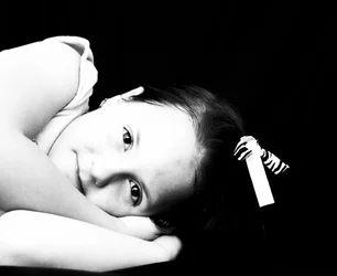
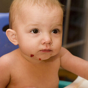
That level of contrast does not seem to me to advance the artistic or pictorial appeal of the image...it looks too chalky for a picture of a sweet little girl.
Technically, for the standard client, it will be to white with a lack of detail. but if this is for an arts project with some idea behind it being so blown out, it could be ok. since I do not know what you wanted to achieve, I cannot judge.
I think the new version is better in terms of the whites.
Assuming that this is meant to be a regular portrait (not for an arts project as Alex mentioned earlier), I personally would also like to see a bit more detail with her hair, it's disappearing into the background.





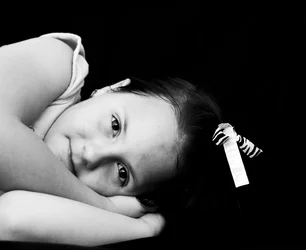

 ... I used the adjustment brush to increase the exposure of her hair without trying to make it look fake. Also soften the skin a little.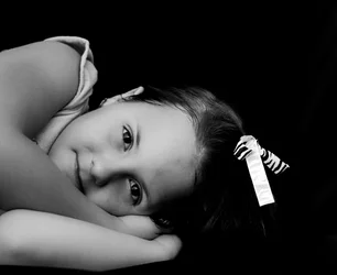



![[No title]](/data/xfmg/thumbnail/32/32930-09414fc020c2a60a456ff59a05c5ef8f.jpg?1734162706)