There is way too much dead space in both of these. The blank white area on the left of the photo adds nothing to the image. #1 I would have shot in portrait orientation with some blank space on her right, but not that much. #2 is fine except I'd prefer a tighter crop...i.e. crop with the same aspect ratio but leave less space above her head and less space to her right.
That said, the exposure looks spot on. I don't care much for the pose in number 1, but number 2 is a very cute photo.
I'm no expert of portraiture, especially where studio lighting is involved, but I'd make the following observations:
Photo 1:
Some fill light from the right would help. It's not intended to be a moody shot, so brighten it up a bit
The pose seems very rigid and it's not telling much about the subject. Get some movement going and then freeze the moment with the flash
It looks as though the dress could have done with a little work with an iron.
Photo 2:
Same point with the fill in light as #1
The pose looks awkward, like she may be struggling to stay balanced
Get in closer
Her interest appears anywhere other than being photographed - I think for this type of shot it better if she was looking into the lens (with her eyes, not necessarily facing the camera square on). Ask her to flirt with the camera.
...but Like I said, I know nothing and will willingly defer to someone with more experience.

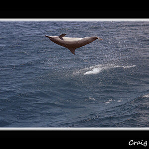
![[No title]](/data/xfmg/thumbnail/39/39187-9ec2507d9e5ef2843f7f00127c7abb4c.jpg?1619738905)
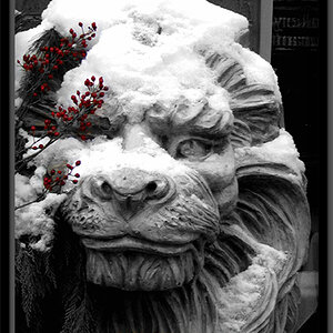

![[No title]](/data/xfmg/thumbnail/36/36400-97a007ae878e1032155c7a7d47eeba73.jpg?1619737552)


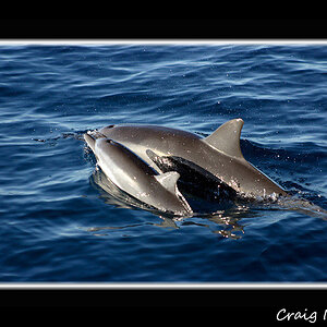
![[No title]](/data/xfmg/thumbnail/39/39188-ef8378fc9359eda8e99899c2e12f3892.jpg?1619738906)