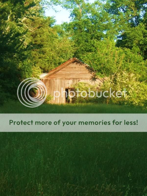
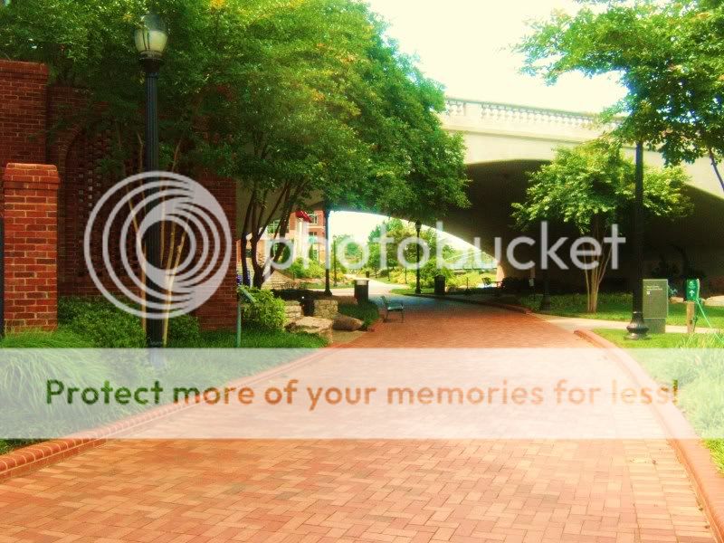
I think they're all centered, number 2 is the best but it's overexposed.
1. More sky, less grass and something interesting to focus on.
2. More brick, less sky. I like how the road brings me in on this one and want to see more.
3. Overexposed and nothing interesting to look at really. Maybe a B&W contrasty post process would help a little here.
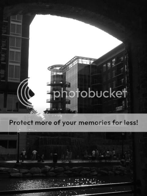
4. Underexposed and at that breaking point where zooming in or out could have made this photo better. The way it is there's either not enough of that upper arch to add depth or the arch should be gone so I can focus on that cylindrical building. Too much in the photo, I'm not sure what I'm supposed to be looking at. The people, the falls or that cylinder.


![[No title]](/data/xfmg/thumbnail/37/37425-6c82b8d207549743954f4b99b56a8153.jpg?1734170466)

