Keep horse'n around. I'd very much like to see what else you come up with.
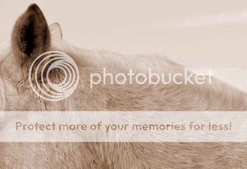
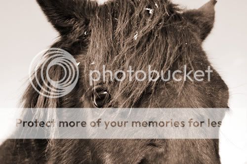
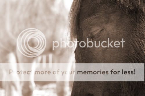
I have quite a few shots similar to your 1 and 2.
I like the fact that you kept the hue the same throughout and I like close ups that become almost abstracts.
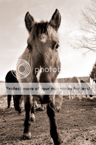
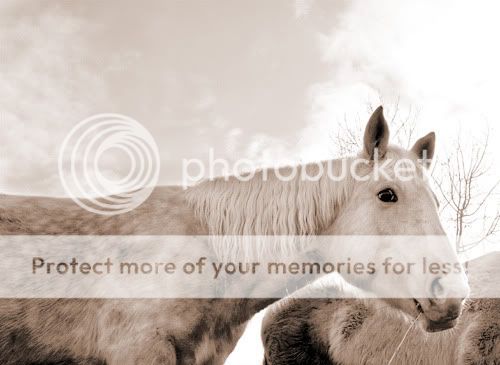
What I do not like is the distortion in 3 due to the horse's head being so much closer to the camera than anything else in the image. 3 and 4 are too wide and include too much stuff that doesn't look good. Going wide is fine but try to avoid the business that doesn't add any value such as parts of trees, parts of other horses, etc.
5, I like the horse on the right but I hate the one on the left. Again, it is a matter of control of the background. If you can't move the horses around to where they get you a nice photo, you may want to wait until they move into the right place
Overall, it seems that you could boost the contrast somewhat but I'm not sure without seeing it.




![[No title]](/data/xfmg/thumbnail/37/37170-3e18af574ed51cce5bdf99af9d3cab40.jpg?1734169892)
![[No title]](/data/xfmg/thumbnail/37/37106-bbbc8e30f409f82c56bead43c7565d5a.jpg?1734169829)
![[No title]](/data/xfmg/thumbnail/35/35263-86f580cf5d28d23109a45984030a79ad.jpg?1734166920)
![[No title]](/data/xfmg/thumbnail/32/32706-50b778fbc110c8ea4472547d54c6a923.jpg?1734162290)