Kind of Blue

invisible

Been spending a lot of time on here!
Joined
Mar 10, 2007
Messages
5,213
Reaction score
983
Location
Canada
Website
www.federicobuchbinder.com
Can others edit my Photos
Photos NOT OK to edit
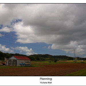
f/14 @ 60 mm, 1/2000, ISO 200


(By the way, "Kind of Blue" has just turned 50...)
 
Last edited:
Fredrico, Sorry, but you can't have a title like that without any reference to Miles.

Kind of Blue

Other than that, we're cool and your photo is pretty damn good too.
 
Hahaha! Look closer, my friend! (Listening to "Freddie Freeloader" as I type, by the way.)
 
Homer.jpg


Well done......

The effects of "skimming" a thread.... :lol:
 
Nice... Were you fishing?
 
So simple, yet so pleasing. I like it. :)
 
Nice... Were you fishing?
No... I just love sitting on the shore of this particular lake and staring at the water. It's just soothing. This is the first time I try to capture the feeling.

So simple, yet so pleasing. I like it. :)
Exactly the idea :)

Thanks Yemme and Josh!
 
Pretty. The texture in the water is almost repeating. Very neat.
 
Thanks Roy. I think it needs a white frame, but I don't have a clue how to create one in PE5.
 
In elements 6, it is as follows: Image, resize, canvas size. Then add the amount of pixels to add.

Your original image in this thread is 800x530. To add a white 100 pixel border, make the canvas white and 900x630.

You can do many borders to. Like a 50 pixel black and then a 75 pixel white, or whatever your heart desires.

p792386546-4.jpg
 
Last edited:
Okay, I'm gonna be the one that says "I dun like it".

I dun like it. Don't get me wrong, it's a darn neat idea, and I love the repeating patterns. That said, there are few things that I think could be "fixed" in PP. For one, there are little hotspots of white in the upper right of the water, which could easily be taken out with judicious use of the clone stamp and heal tool (when an image is so simple and repeating, minor things like this really stand out for me). The sky looks a little bland and a tad...noisy, I think. Some noise reduction, and a gradient layer mask for a hue/saturation adjustment layer coming down and ending before the horizon to saturate those blues a bit more would give a nice reflection of the water, I think.

Similar goes for that bright white on the horizon; I wouldn't take it out completely, just maybe just tone it down a little with a low opacity clone stamp and a bit of heal to fix up rough spots caused by the clone stamp. (Then again, this is one of those edits that I would try just to see if it works, and might go back on.)

That's just what I would try with the image though. Cool concept. :)
 
Montana, thank you very much for the tip, I will try that next time! :thumbup:

musicaleCA, it's cool if you don't like it. I don't expect everybody to like my photos (in fact, I expect a vast majority of the people to not like them, or to not give a crap at all). I admire your eagle eye: I hadn't seen the hot spots, even though I enlarged the photo quite a bit during PP. I just can't explain the noise in the sky (there's noise in the water too); this was shot at ISO 200, the minimum available with my camera. I appreciate the PP ideas, but for the time being all of that is rocket science to me :)

Thanks to both of you for the feedback.
 

Most reactions

New Topics

Back
Top