Landscape vs Portrait - Discussion, C&C

Bo4key

No longer a newbie, moving up!
Joined
May 6, 2011
Messages
906
Reaction score
127
Location
British Columbia
Website
www.flickr.com
Can others edit my Photos
Photos OK to edit
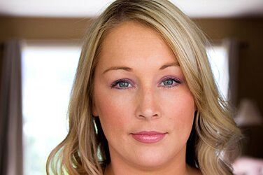
I find myself shooting more and more portraits in landscape orientation. I know it's wrong for the most part but I seem to like the style.


Allison by Boaketography, on Flickr

I guess I'm looking for critique on the processing here.

I like the soft light in this shot, but I find that the background is a bit noisy. I don't find that it has been oversharpened but I am looking for some comments on the post-processing.

Thanks
 
She's shown as what is called,"A floating head," meaning...no neck...no shoulders...no torso. And the head-chop...uggg. Why crop off the top of her head, and leave her neckless? Just so you can show that ugly window behind her? The bright window behind is very distracting. This is not a portrait--this is just aiming and firing. It shows nothing good about her really. She might have a pretty blouse on. Or a lovely necklace. But we'll never know.
 
The catch light is way busy!

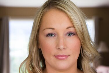
Hope you don't mind.. $9091209044_a44a3ecf71_k.jpg
Added some sharpness and contrast in Gimp
 
I would have preferred this shot in Portrait. that aside I think the processing is very nice and natural, not overdone. Perhaps darken her pupil a touch and a very slight sharpen up on her iris? She is very pretty. :)
 
somehow i have a problem looking at portraits. I most of the time automatically qualify them as formal pictures (for passports etc.). the picture has to be so beautiful it would be an exception.
 
I prefer HL's edit to the original (although it is a touch overdone)... the processing on the original is fine, except it looks soft due to the lack of contrast. It almost looks like you blurred her...

Seriously ... look at them compared side by side.... (with the distracting, ugly, unnecessary background removed)

$hhhh.jpg

As far as horizontal portraits go, I think a lot of it started with Noobs that were either too lazy to turn the camera, or didn't know better (sure is popular on Facebook!). IF there is a reason to show the background... fine, then shoot it horizontal. But keep in mind that it WILL detract from your subject unless very nicely done. Floating heads are not really that cool either, unless is a police mugshot, or for a passport.

But if that soft, fuzzy out of focus look with a really distracting background is what you were after... then you nailed it!
 
Last edited:
Thanks for the input!

I do find the open shades/window distracting and thought that the mostly bland colored background wouldn't be too distracting, I guess I was (quite) wrong.

As for the lack of contrast, that was the softer look I was after. But I can see where some people prefer a photo with more pop, for a lack of a better term.
 
i like some portraits in landscape but this one should not have been imo. her face is rather round and going portrait may have helped elongate.
 
I like your softer edit better but just pop the eyes?... I had a QUICK go....

$girl.jpg

darkened pupil, enhanced just one side of the catchlight, sharpened the iris a tad. I dunno if it's really much of an improvement. :) Just fun to play.
 
I like your softer edit better but just pop the eyes?... I had a QUICK go....

View attachment 48335

darkened pupil, enhanced just one side of the catchlight, sharpened the iris a tad. I dunno if it's really much of an improvement. :) Just fun to play.

That actually helps a lot... the eyes are the most important aspect usually...
 
To be honest, I've never done any touch up on the eyes in post so the thought never crossed my mind.

I'm self taught when it comes to post processing and this really helps out a lot. I'm happy to pick up new processes and key points every time I post a photo here.
 
I'm a fan of portraits in landscape. But instead of just telling you that the picture sucks and is a floating head, here's a bit of a tip (well, I think so). It applies to shooting in both orientations...

Get higher up, so you are shooting down on your model. I dont mean right over her, but enough so she is looking up at your. Back off just a bit to get some shoulders in there and the top down perspective will help with the overall framing.
It will also stretch her head up, and if you are using light correctly, can cast a nice shadow under her chin hiding any double chin. :).
 
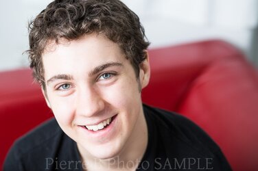
This is kinda what I mean. It's from a shoot a few days ago that i'm currently editing.

$dustin_samples-34.jpg
 

Most reactions

New Topics

Back
Top