Light Fixture C&C

dak1b

TPF Noob!
Joined
Jun 30, 2009
Messages
1,554
Reaction score
0
Location
Northern California
Can others edit my Photos
Photos OK to edit
Wat shot angle do u like better and why? this is same light fixture in each shot jus different angles. C&C welcome! thanks! enjoy!

1)
3778445679_fdf1736179.jpg


2)
3779246594_cd3ef67d2f.jpg


3)
3779242632_f98d354faf.jpg
 
The second is the best angle because it's the only one that reveals the three-dimensional form of the subject.
 
i think i'd like the first if it filled more of the frame...

the second one is cool cuz you can really see all the details and transparency of the shades... but seems a little crooked...

i like the third one too... just wish they ddin't have those lamps in the ceiling!
 
another for #2. stunning! #3 is nice as a neat geometric pattern though. i like it!
 
#3 is the best because it is really taking the subject beyond what it is.
For something like this you really need to pay attention to your angle, and get all the recessed lights lined up perfectly symmetrical.
 
#1 - This shot is boring. Filling the frame with the subject might have helped.

#2 - This is a dramatic shot (I hope you can see the difference between this one and the first shot) but could have been pulled off a little better. If you took a step back and to the left I think this shot would have been much better. You may want to clone out the fire sprinklers and recessed lamps.

#3 - I actually like this shot and it's one of those times when centering the subject is the right choice...but you should have considered the fire sprinklers and recessed lighting when composing the shot...or clone them out.
 
I like #3 the best, very abstract. In looking at it, I guess in this case you would not have been able to get all the recessed lighting to sit in-between each of the lamps shades, but it would have added another interesting aspect to the shot if you could have.
 
I like all 3
1. Is something I can find in sears catalogue to give me an idea what I will be buying.
2. Artistic and goes a few steps above "snapshots" vs putting thoughts into an image.
3. Same as two
Though it's my preference, I'd probably readjust the WB either preset it or in PP - its a bit to warm and jaundice for my flavor.
 
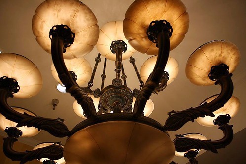
I like 2 and 3. I like 2 because of the angle. Its not something you see every day. Even if you see the fixture, you wont usually see it at this angle and with this detail. I also would advise you to not have cut off the left side of the fixture.

I like 3 because it does give a sense of ambiguity to the fixture. Also gives a dimension of the fixture thats not normally seen. In general, all 3 are a little warm and yellow. WB correct is in order.

On a more off-subject thing, for future reference, could you type with proper grammar? Or at least capitalize the first letter of your sentences? It shows that you respect the peoples' opinions more and makes you sound more professional. Maybe this is just me, but Im sure others enjoy being able to read without having to work out what you're actually saying.

Original: "Wat shot angle do u like better and why? this is same light fixture in each shot jus different angles. C&C welcome! thanks! enjoy!"

Revised: "(Insert any type of background to the shot here. (why you took it, what you were trying to achieve, etc.)) Which of these shot angles do you like better and why? Each shot is of the same light fixture, just shot at different angles. C&C welcome! Enjoy!

Thanks."

Or something along those lines. JMO. <-acronyms are okay in most cases, as long as most can understand them. Im not a moderator or anything, but Id really like to see some of the people typing respectfully and correctly.

Thanks.
Mark
 

Most reactions

Back
Top