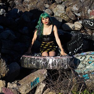
I wonder - does anyone agree with me that the negative space here adds to the photo? - I don't mean to be argumentative, but that was my thrust with the crop (or lack of)...
hmmm i'd like to see a version cropped. i usually like strange crops, but this distracts me quite a bit. maybe if i didnt have to scroll up at down to see all of it.
I wonder - does anyone agree with me that the negative space here adds to the photo? - I don't mean to be argumentative, but that was my thrust with the crop (or lack of)...
Oh, absolutely! In fact, without it, I suspect there'd be no photo. I do however wish the lighthouse was a bit off-center. But look at that sky! I think I'd rather loose the lighthouse than any of that sky. IMHO
I wonder - does anyone agree with me that the negative space here adds to the photo? - I don't mean to be argumentative, but that was my thrust with the crop (or lack of)...


![[No title]](/data/xfmg/thumbnail/37/37602-1ef8dbb1c2d0e4ff347ee65d328c3603.jpg?1619738147)

![[No title]](/data/xfmg/thumbnail/32/32721-63e870bb6055043e46744e5ac505d9bf.jpg?1619735627)
![[No title]](/data/xfmg/thumbnail/36/36299-468f060314a0ac2bf5e37da1c33149d2.jpg?1619737493)

![[No title]](/data/xfmg/thumbnail/37/37606-3c9ffb5906173fa2aa489341967e1468.jpg?1619738148)