What's new

Long Beach Apartment Building

sleist

Been spending a lot of time on here!
Joined
Nov 8, 2009
Messages
3,872
Reaction score
2,368
Location
Somewhere in Florida
Can others edit my Photos
Photos NOT OK to edit
i-LsJWmW4-X2.jpg
 
I really like this one, but it is tripping my eyes slightly. I looked at it a long time trying to figure out whether or not it was off center. Then I realized the very top layer of the cake was shifted slightly left, but the rest is centered. Great sky, too. Is it as captured or processed (well beyond the rest)?
 
Thanks deeky. It does mess with the eyes depending on the size you're viewing. ;)
As for processing, I straightened the raw image and cropped slightly on the right.
Saved as 16 bit tiff and processed in Silver Efex Pro for B&W conversion.

Thanks for the comments.
 
Now that's a crop. Does jump out at you...
 
Cool shot Sleist.

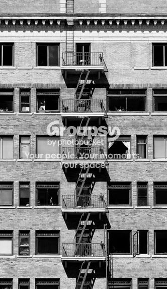
I think the meat of the subject, for me, is the repetition and the geometry. I messed around with a few crops, and arrived at this one:

Crop_zps86b141d7.jpg
 
Cool shot Sleist.

I think the meat of the subject, for me, is the repetition and the geometry. I messed around with a few crops, and arrived at this one:

Crop_zps86b141d7.jpg

I like it Rotanimod, but I like the original better. My only regret on mine is framing too tight.
When I took the shot, I was drawn by the solitude of the building as well as the fire escapes and windows.
I lose some of that with a crop like yours, but I understand why you want to focus on the parts rather than the whole.
I also get why my framing might fall short of my goal.

Thanks for the taking the time. Much appreciated. :)
 
Rotanimod said:
Cool shot Sleist.

I think the meat of the subject, for me, is the repetition and the geometry. I messed around with a few crops, and arrived at this one:

This is a mistake because one of the best elements of the shot is how the tree totally throws off the symmetry. It adds an element if spirit to the shot.

Btw... Nice shot. I agree the crop is maybe a little aggressive, but not too bad. In truth you could probably clone stamp yourself a little more space.
 
Rotanimod said:
Cool shot Sleist.

I think the meat of the subject, for me, is the repetition and the geometry. I messed around with a few crops, and arrived at this one:

This is a mistake because one of the best elements of the shot is how the tree totally throws off the symmetry. It adds an element if spirit to the shot.

Btw... Nice shot. I agree the crop is maybe a little aggressive, but not too bad. In truth you could probably clone stamp yourself a little more space.

Yes, the tree rocks. Glad you see it. :)
 
:thumbup:
 
I like it Rotanimod, but I like the original better. My only regret on mine is framing too tight.
When I took the shot, I was drawn by the solitude of the building as well as the fire escapes and windows.
I lose some of that with a crop like yours, but I understand why you want to focus on the parts rather than the whole.
I also get why my framing might fall short of my goal.

Thanks for the taking the time. Much appreciated. :)

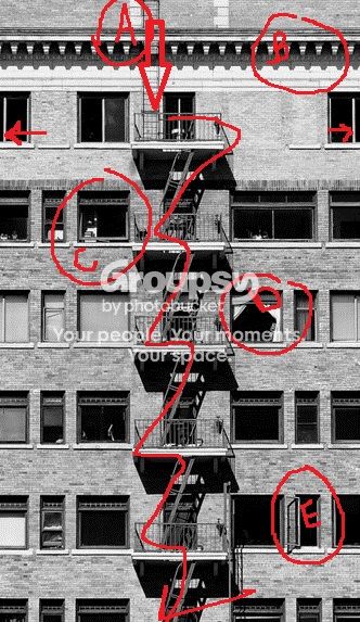
I probably wouldn't have bothered with the shot in the first place if I didn't like it a lot. Or at least some part of it a lot. I want to explain the reasons for the crop a bit more.

markedup_zpsaebddd22.jpg


A. The eye first travels to the ladder, and naturally follows its way out of the frame. It carries you through the frame in a zig-zag motion, and brings you past a variety of interesting windows. The crop at the bottom margin allows the imagination to fill in how tall the building is. There isn't any visual clue to how long it will continue to go.
B. A nice roof edge to break up the repetitive patterns of the windows/fire escapes and give the ladder some dominant visual space.

As you travel down the frame you encounter:
C. Partially opened window-- visually interesting
D. Opened curtains, nice contrast and mystery -- A bit Hitchcock "Rear Window"
E. Nice shadows by the opened window

The tight left and right margins, indicated by arrow, bring symmetry and balance and allow the viewer to "fill in the blanks" on the margins.

This crop, to me, is more symbolic and more about shape/pattern/repetition and suggestion versus a shot of an identifiable building.

I imagine a large version of this would present nicely in a coffee shop. There's enough visually interesting elements for the eye to explore, while there's enough left to the imagination.

I believe your original shot has some things working against it. Namely, the visual clutter around the bottom, bottom left, and right frame. The top of the roof being lop-sided and the tree are too much of a counter-balance to an otherwise symmetrical urban study.

 
Nah. It's good.

You're over analyzing it.

It has some issues and you could tweak and adjust a few of them, but the image as it is is fine, and in fact there's even a little but of a laugh in it. The shot has some spirit.
 

Create an account or login to comment

You must be a member in order to leave a comment

Create account

Create an account on our community. It's easy!

Log in

Already have an account? Log in here.

Back
Top Bottom