
TylerMWise
TPF Noob!
- Joined
- Aug 28, 2021
- Messages
- 7
- Reaction score
- 2
- Location
- United Kingdom
- Website
- teamtbm.org
- Can others edit my Photos
- Photos OK to edit
Hey!
I have recently taken these photos, I am wondering if anyone can give me separate feedback for any of these photos? It would be very much appreciated, and it means I can improve my photos as I get better at photography:
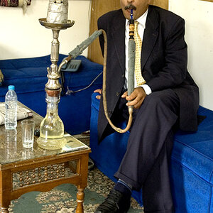
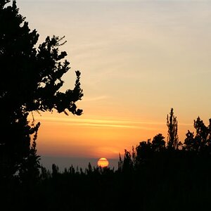
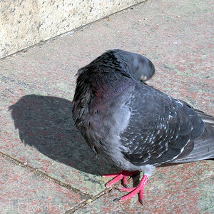
Image 1:

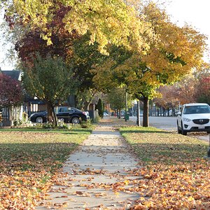
Image 2:

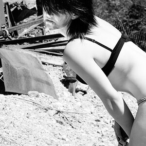
Image 3:

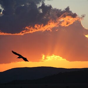
Image 4:

Image 5:

Thanks, Tyler")
I have recently taken these photos, I am wondering if anyone can give me separate feedback for any of these photos? It would be very much appreciated, and it means I can improve my photos as I get better at photography:
Image 1:
Image 2:
Image 3:
Image 4:
Image 5:
Thanks, Tyler
Last edited:

![[No title]](/data/xfmg/thumbnail/35/35586-d552a369f369a1796256b9df897a8d91.jpg?1619737061)


![[No title]](/data/xfmg/thumbnail/31/31742-596f6bbc60b2ba7fed2cd25f5aacf41c.jpg?1619734985)

![[No title]](/data/xfmg/thumbnail/38/38294-cb4a5aa0ded725d4c694e6eebe276f0d.jpg?1619738564)