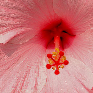
Both versions are overall too dark. The first one has an overall blue temperature. And the lighting is rather harsh and flat (were you using the built-in flash)? The composition isn't working for me (you have half a flower on the right edge, and left edge). There are just a lot of things that aren't really working for me in this shot, sorry. If you'd like me to go into greater detail on any of the critiques I posted above, feel free to ask me. Or if you disagree completely, that's fine too. To each their own, and I'm more than happy to elaborate on my criticisms if you want me to. We're all here to learn.
wow trenton, that was so courteous.. lol his was a bit harssh but i agree, crop the righthand flower out. ok after this bump the saturation and exposure to allow brightness and more "popping" color into the shot. then either using the burn tool, brightness/contrast,or clone stamp get rid of that stripe of gray, it takes away from the shot.
Sounds good. Harsh is not necessarily always "a bad thing". As you said, "we're all here to learn". I'd say your critique is exactly what I was looking for.
I'll re-post that soon to see if I'm on the right track.


![[No title]](/data/xfmg/thumbnail/37/37625-7e132688457d56e50320a8c99a79fe38.jpg?1619738154)
![[No title]](/data/xfmg/thumbnail/32/32953-da4fe78e854d5dbe210d58591ccf42d4.jpg?1619735787)