What's new

Maternity, potentially NSFW?

amolitor

TPF Noob!
Joined
May 18, 2012
Messages
6,320
Reaction score
2,131
Location
Virginia
Can others edit my Photos
Photos OK to edit
.
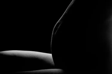
$Maternity.webp
 
Nice man.. I am about to do a nude/semi nude maternity tomorrow night. I would have liked it better if you rotate her more counter clockwise. The belly button is messing with the light sculpting a little bit. I rather see more round shape of the belly.
 
I like the idea here but I think it is a little too dark. Maybe its my monitor sitting directly in the morning sun but I can't make out any detail or roundness of the belly (depth wise). I feel like the light needs to wrap around the belly more before dropping off.
 
  • Thread Starter 🔹
  • Banned
  • #4
Thanks!

This was actually an off the cuff pose with an existing rim lighting setup. I had to struggle to get the amount of wrap I got! I liked the abstract line I got here, but I do agree that more wrap would definitely be more appealing.

ETA: I also liked the lumpiness. There's a certain verity to it -- this is what pregnancy looks like, it ain't all sweeping curves and photoshopped Demi Moores.
 
It is just a smidge dark. I also feel it's a little too generic/cold. Her right hand (or left if she was wearing a ring to catch light) on the lower portion of her belly, so light touches it the same way as the rest of the image, would have given it a more personal, intimate touch.

 
It is just a smidge dark. I also feel it's a little too generic/cold. Her right hand (or left if she was wearing a ring to catch light) on the lower portion of her belly, so light touches it the same way as the rest of the image, would have given it a more personal, intimate touch.

I agree. I think this person made a wonderful suggestion.
 
Sometimes less is more....and this is one of those times. There was an article on Yahoo the other day, asking if the Demi Moore pose was now passe. I don't mind the belly button modulating the light....it is part and parcel of the belly...it adds a subtle depth clue, and when seen in a larger-than-web form, will probably look interesting. Seen at TPF size, the photo cannot convey all the information the shot carries with it when shown large. I think this is a very good lighting approach. A tiny bit of fill light from the front would not hurt, but is not entirely essential either. Plenty of room here for posing variants too. Back pat.
 
I'd consider a square format, by bringing the right side in. Other than that, the lines and lighting work well for me.
 
Very nice and it's moody... I would not change anything.
 
Sadly, this is not NSFW.
 
I like the amount of light sculpting the belly - I agree with Derrel that this is a case of less is more. And I too like the "lumpy" belly. The only nitpick I have is the amount of light falling on her right thigh, it's a bit large and bright (I like what's falling on the left thigh).
 
Really nice pic. I agree the lump in the belly is not the most ascetically pleasing but as Amolitor stated, This is what pregnancy looks like. I get the feeling of a baby foot or elbow poking out right there and it makes the image that more heart warming. This image is also a great one to play with in PS being that its fairly easy to add/remove some highlights and give an already great image a boost.
 

Create an account or login to comment

You must be a member in order to leave a comment

Create account

Create an account on our community. It's easy!

Log in

Already have an account? Log in here.

New Topics

Back
Top Bottom