"Me In Red" (Self Portrait)

enezdez

TPF Supporters
Supporting Member
Joined
Aug 2, 2015
Messages
2,169
Reaction score
1,774
Can others edit my Photos
Photos NOT OK to edit
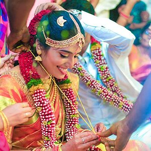
GFX 50R
f/14.00
ISO 400
1/125 Sec.
GF 80mm f/1.7 R WR
63mm Equivalent
NISI Black Mist Filter 1/8

(Processed In LR & PS)

OCF Right Godox AD300 Pro with shoot through Umbrella & Godox XPro(F) Trigger.


Me In Red (Self-Portrait).jpg


I am looking for C&C on my Self-Portrait. While this is the very best self portrait I have created, I know it can be better. I am looking for pointers/suggestions either for lighting and/or posing...


Thank you in advance for your critique...

Enezdez
 
I don't see the lighting as that big of an issue, though perhaps some Van Dyke Lighting for drama. What I see is more a post-processing issue in the contrast department.

Ah, after taking it into Photoshop, I realize that while contrast is a bit of an issue, it is more that your hand is dominating your face. As much as I worked on the other parts, the more it was apparent the hand keeps drawing the eye away from your overall expression. Perhaps a shallower Depth of Field aperture...5.6 or thereabouts and knock down the light to about 2/3 on the (physical) left side of your face.

And, the red is also overpowering. Perhaps a darker red or toning it down or even a vignette.

You don't allow edits so this is about as much as I can offer.
 
Last edited:
Self portraits are hard, most times it ends up being a best guess on lighting. In this case, the lighting set up looks good, maybe move it a hair more toward camera axis, but overall good. I'm not a fan of shoot through umbrellas, because of the light scatter. A reflector gives you more control over the light direction, and less chance for reflections off other bright objects.

Exposure, needs work. Though I have the Black Mist filters, I'm not a fan of them for portraits. They work well for their intended use to soften bright background lights, and help keep them from blowing, but they tend to cause softness issues and washed out colors on portraits. That might well be some of the contrast issue mentioned in the above post. The big thing as evidenced by the histogram is the lack of correct White Point and Black Point setting.
abc.jpg


Notice the lack of data in the deep shadows. That can affect more than just the shadows, it can cause bright colors to appear washed out. Adjusting them will cause the image to pop. In addition, try these settings

aaaa.jpg


Luminosity Curve and HSL panel
bbb.jpg


Adjustments to the Blue channel in curves.
cccc.jpg


In addition set your sharpness to around 40 and masking
to 70. Put the focus back on the face with a post crop vignette of around -9. After making the above adjustments, this was the histogram.
ffffff.jpg


At this point it becomes a matter of tweaking settings and dodging and burning.

On pose with your build I'd rotate the body more. Doing so creates a flattering slimming effect. In this day and age of all the gender talk, I'm almost afraid to say it, but there are tried and true generally accepted Masculine and Feminine that are generally understood by portrait photographers to refer to a pose containing certain basic elements—much of it relating to the direction the subject’s head is tilted. In the masculine pose, the head and body are turned in the same direction and the head is tipped toward the low (far) shoulder while keeping the head at a 90 degree angle. I know sounds difficult but it isn't really. Suggested reading on posing and portrait photography is Monte Zucker's Portrait Photography Handbook Amazon product ASIN 1584282134 He breaks it all down is simple to understand methods.
 
Bump for more comments
 
Bump for more comments
I agree with your assessment but I don't use those settings like you do as I do most of my post using TK Luminosity masks, and On1. Same difference in the end, just a different avenue to get there.
 
I agree with your assessment but I don't use those settings like you do as I do most of my post using TK Luminosity masks, and On1. Same difference in the end, just a different avenue to get there.
I used to use luminosity masking in PS. I have a custom action that will seperate multiple highlights, midtones and shadow masks. I really don't use it much anymore prefering a simpler approach using PS and LR.
 
@smoke665 All Right! :lol: I did the corrections more/less like you indicated, I couldn't get the curves exactly like you said but came close...and it would not allow me to move the Dehaze slider to the positive....the image just turned black...

Me In Red (Self Portrait).jpg


@smoke665 I hate to admit it but you don't know what you don't know because you are missing it...who said that???

When you find the guy give him a medal....

And yes, I like this version much more, the color shift deemphasizes the hand as well which I always thought it was an issue with the image...

Thanks!

Enezdez
 
I still find the red hoodie too dominating but like that you toned down the hand so it isn't so prominent. I might drop just a hair of red out of your face, especially around the ears and nose, but that's just me. (Note that you have a bit of purple going on in your (physical) left eyebrow.
 
I hate to admit it but you don't know what you don't know because you are missing it...who said that

Whoever it was he must be pretty smart. 😁

I posted the settings not for you to copy but to do, and more importantly "observe" how these settings affected both the image and histogram. All images will be different, this why you need to understand what the sliders do, and when to use them. The eye can be fooled, but the histogram is a graphic representation of the data in the file you have to work with.

Now that you've got to this point the real work begins, tiny tweaks, dodging and burning, tone mapping, etc can take time but the results are what elevate the image from good to excellent.
 
All really good points above.

One thing I will add is that be careful when adding things in front of the subjects face.
If the foreground object is closer to the light source it will be brighter than the face and will by default become the focal point. In this instance your lighting is at a good angle to keep the hand slightly darker than your face however if the lighting was a bit lower and more on axis with the camera it may have caused an issue.

A great beginning to self portraits. As smoke said, your histogram is a valuable feature to ensuring you are getting every bit of light, colour and detail in camera which will lead to less time in post.
 

Most reactions

New Topics

Back
Top