I love seeing which images people gravitate too. I am often wrong in my guessing. Such as here, and the love for #3 :thumbup:
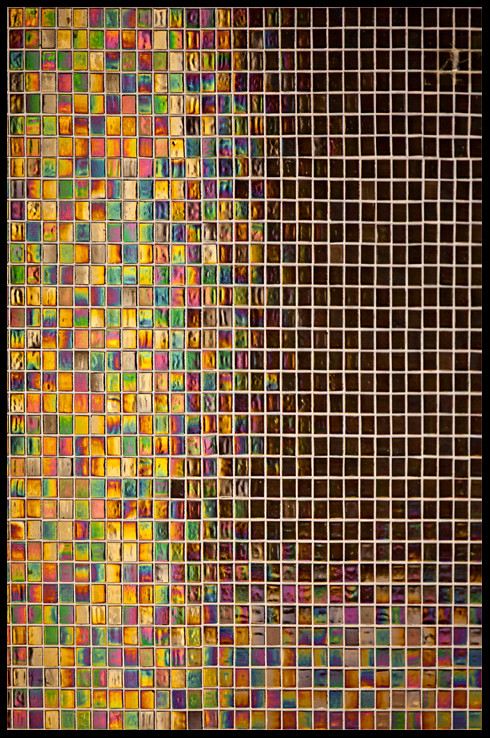
Pen, #2 is simply a dichroic glazed tile wall. It was in the entry way to a restaurant. Caught it out of the corner of my eye. The colors change and "move" depending on your angle of view.
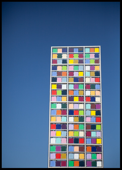
The perspective on #1 was interesting to work with. I debated correcting it, to make the tower square. I really felt the little bit of quirk is better than squaring it up. The tower leans back and is slightly twisted, so it's not entirely square to begin with. I do like the play of so much going on with the color tiles, and the clear blue sky, but I don't think it is a terribly strong image. It's one of those "I just like it" things.
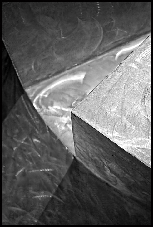
The 3rd one, I didn't think people would like. It is from weird stainless steel sculpture, and I spent quite a bit of time "finding" this image in it. I converted to b&w be cause the blue cast from the sky was distracting.
Thanks for your responses!






![[No title]](/data/xfmg/thumbnail/32/32171-96317e1f56adbfbcf5a9205247a8c2fc.jpg?1734161047)
![[No title]](/data/xfmg/thumbnail/42/42281-7e2c2677bdc791ca1918fb67b6b760c5.jpg?1734176697)