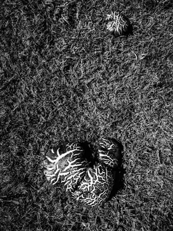
Even if I know it's shrooms now, I'm just wondering what am I looking at. Are you looking for a specific effect ? Abstraction ? Composition isn't working for me. Shouln'd it be in landscape mode ? . The texture however is nice.
I was thinking that it would look better with the camera rotated about 10-15 degrees counter-clockwise. This is not a bad effort, trying to balance two similar (same species) objects, one very large, the other small, against a simple, patterned, natural background. There is no color information here, so you're working with shapes, mass, and VERY little repetition except the ground's basic "pattern" of fine, indeterminate detail, and you're really working with basically one depth plane, and texture...this is a very challenging subject!!! I'm not sure that you got the best angle to show off the relationship between the big mushroom and the very small one--but there are not really a lot of options! Making a good composition out of basically a three-element scene can be very tricky.
"This ain't no hole in the ground," but I think you did passably well. Really, I mean I think this could have been atrociously worse that it ended up, so in my book, that's like a win.
I hope these diagrams don't contravene your no edit rule.
A couple of ideas:
I think it needs a border to define the edges better. The two points of interest need to relate to each other and the confines of the frame. The larger mushroom needs to be further left, almost equidistant from the left edge as it is from the bottom, as the image doesn't really start until you get to this point. The smaller mushroom needs to balance that or be at rest with that for a static composition, I find the best is a combination of the intersections between a diagonal and the Golden Spiral.
You could also turn this into Landscape and ignore the diagonal to add some tension or movement.
I think it works pretty well. I do like the smaller object being closer to the edge of the frame, which is the classic way to achieve balance between objects of different sizes, and I wouldn't do anything to move the larger object closer to the edge (I might even move the smaller object closer to the corner). Changing the angle as suggested might be good, but mainly I would darken the background a bit, especially the highlights.