More pumps

Christie Photo

No longer a newbie, moving up!
Joined
Jan 7, 2005
Messages
7,199
Reaction score
148
Location
Kankakee, IL
Website
www.christiephoto.com
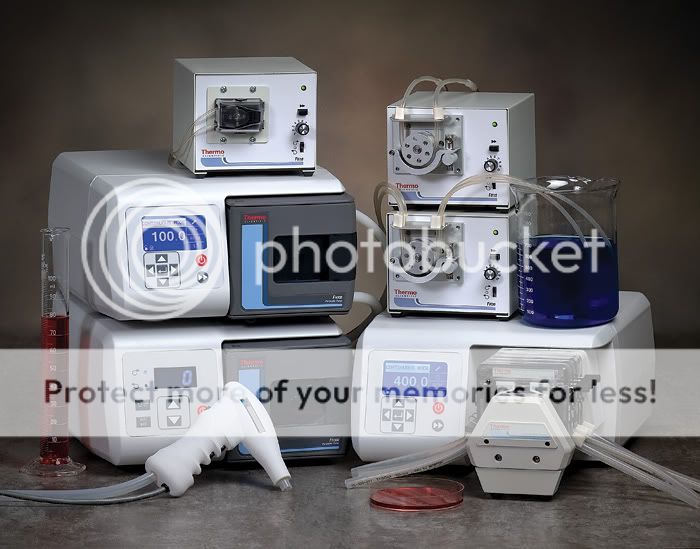
This was for a recent brochure, shot in my studio back in October. 100mm lens set at f/20.

Comments, critique invited.

Thanks!

-Pete

IMG_3750.jpg
 
It is crisp and sharp. Is it also not a little underexposed? (could be my monitor)

The background seems a distracting as well. Is there a reason you did not use a simple background?
 
IT is very sharp that is awesome but I will but more enfasis on the ilumination patern that you are using. IMHO I'm agree with Pbelarge it is a little bit underexposed.
For what I can see you are using two lights if im not wrong but you should use a third light to separate the product from the BG Also when you use multiple lights check the ligth ratio to mantain that contrast very proportional and balance
 
It is crisp and sharp. Is it also not a little underexposed? (could be my monitor)

Under? I don't THINK so, but I'm not sure what you're seeing. I feel the detail of the contours of the white products would be lost if the exposure is increased.

The background seems a distracting as well. Is there a reason you did not use a simple background?

Hmmmm... is it really so busy? This is the setting as per the designer's direction. I feel it's fine. What are you suggesting?

Thanks so much.

-Pete
 
Last edited:
For what I can see you are using two lights if im not wrong but you should use a third light to separate the product from the BG

Yeah... there is a third light on the canvas.

Also when you use multiple lights check the ligth ratio to mantain that contrast very proportional and balance

Huh? I haven't got a clue what you're trying to say here. Are you suggesting the ratio is too great?

-Pete
 
It is crisp and sharp. Is it also not a little underexposed? (could be my monitor)

Under? I don't THINK so, but I'm not sure what you're seeing. I feel the detail of the contours of the white products would be lost if the exposure is increased.

The background seems a distracting as well. Is there a reason you did not use a simple background?

Hmmmm... is it really so busy? This is the setting as per the designer's direction. I feel it's fine. What are you suggesting?

Thanks so much.

-Pete

I actually think it's really well-lit. I agree with you that the details of the whiter areas would be lost if it were exposed more. Great shot!
 

Most reactions

New Topics

Back
Top