Great stuff. So much more polish and enhanced composition compared to your first work. My comments:
1. Love it. Great pose, lovely subject. I'd change two things if possible: you clipped her head--any chance that happened in a crop? Restore that part of her head. Second, the black vertical bars in the background...clone 'em out or at least reduce their intensity...right now they draw the viewer's eye. Outstanding pose though--really, really nice--and a lovely photo.
2. Love the pose, the flintiness in the mood of the shot, the DoF. Part of her butt and her hair is blown out. Any chance of restoring that or adding just a little bit of detail rather than an overblown white spot? Otherwise, that's a damn fine shot...sexy, playful, attractive and artistic. This is outstanding work.
3. As I mentioned in my earlier post to you...background issues for me with this shot. Also, I think the pose would be a little bit stronger if she was leaning back a few inches or leaning forward...otherwise, the pose looks a little stiff. But except for the background, I love this shot of her. Very statuesque, long and flowing, nice triangles going on here, good use of the robe or peignoir. Fine shot of a beautiful woman.
4. Too difficult for me to evaluate. There are some elements to the model that aren't appealing to me (and I know that shouldn't matter). I don't see it as a bad picture. But from an artistic or glamour perspective I don't think it works. The subject may love it as a portrait or PR for her site so in that case it would be a success. I've seen great results playing with water. But to me, there isn't a lot notable about the composition or pose or lighting that makes me sit up and take notice. To put it another way, it's a revealing picture of a woman with unique looks...but there isn't anything about the pose or the picture that grabs me.
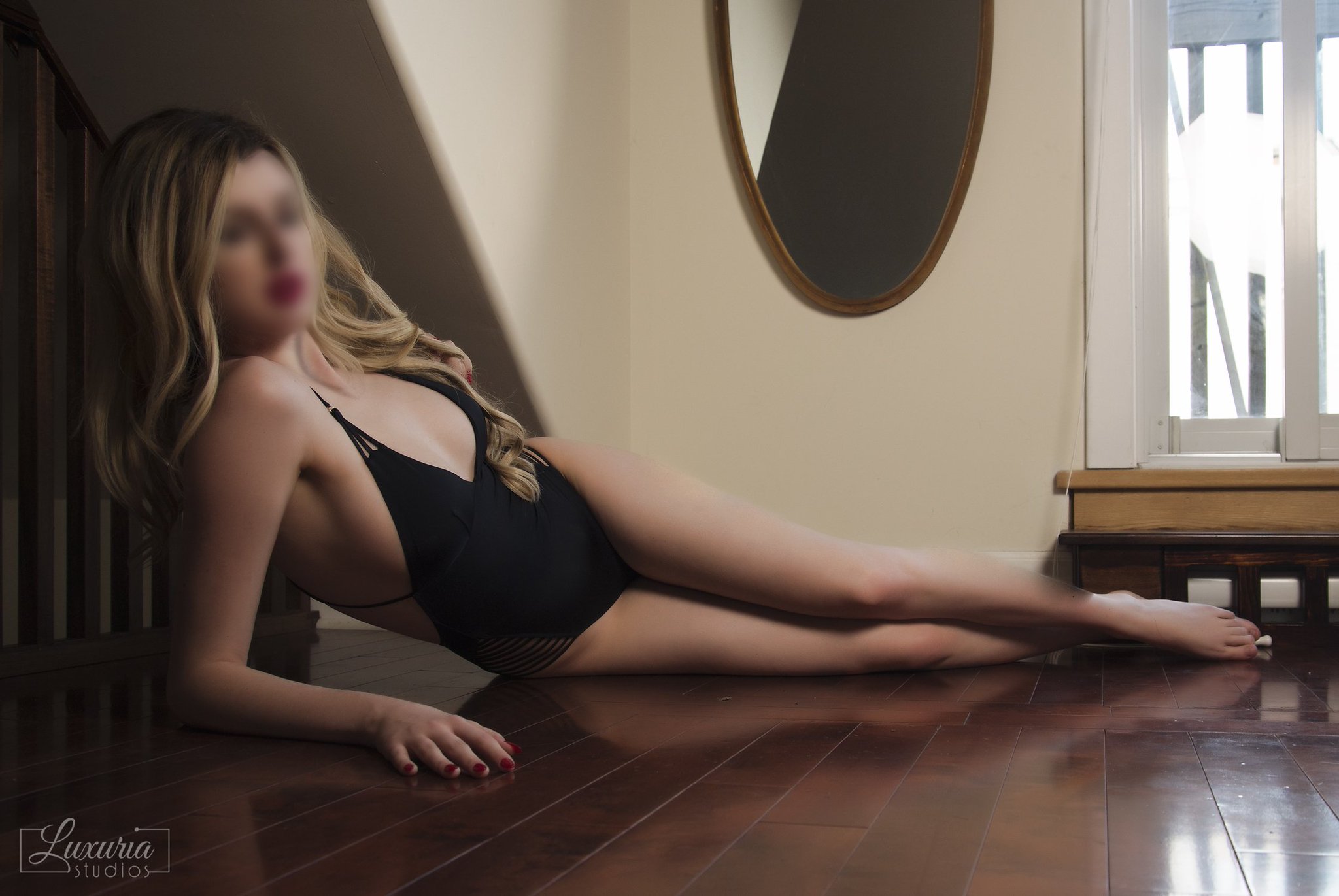
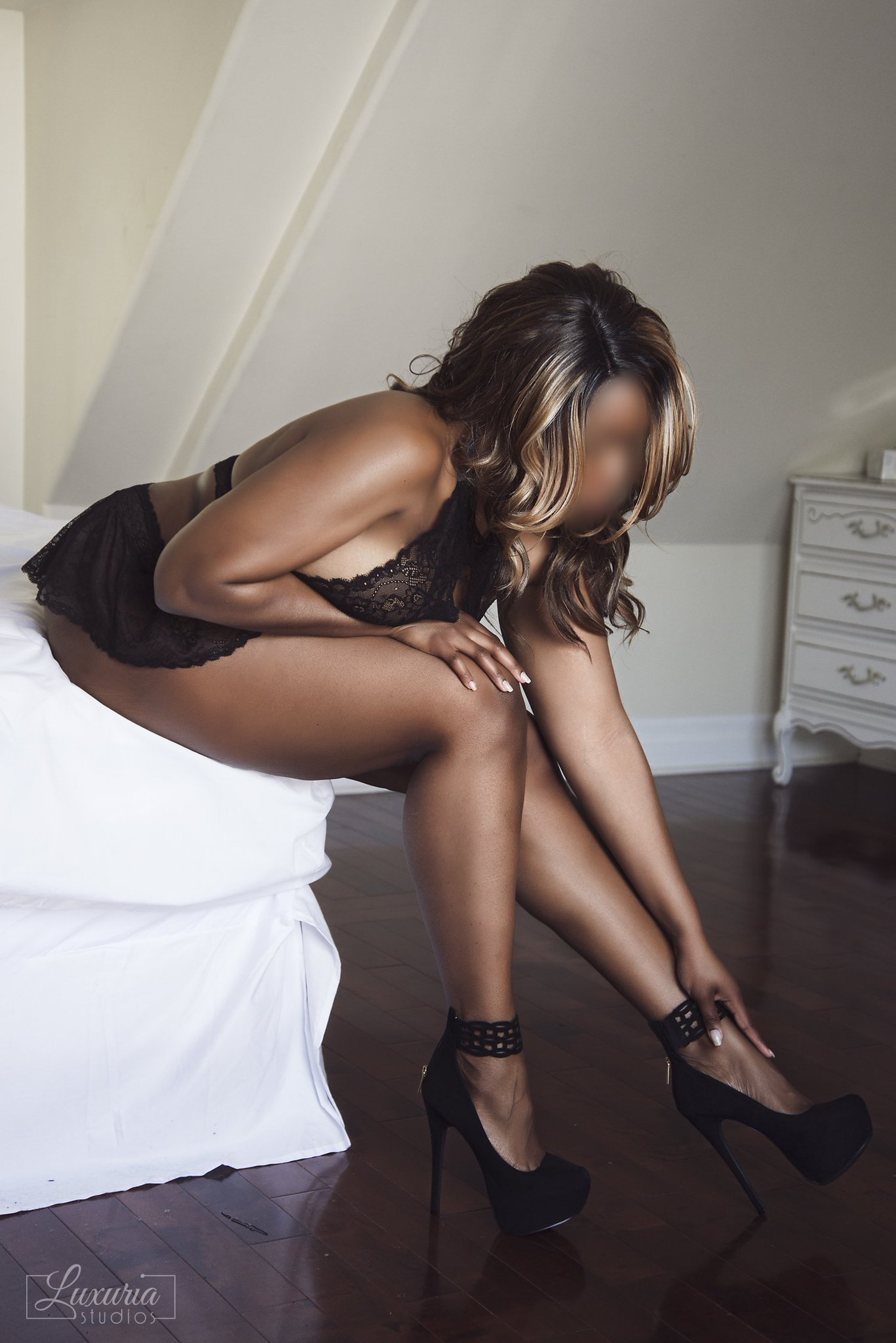
5. Lovely pose, wish you didn't have to blur the face for privacy reasons. I find the bright light/window to the right to be a distraction...can you crop that out? I love mirrors but right now it's just an object...you're not using it to reflect or create interesting visions so I think I'd clone it out unless you think it balances the picture in some way.
6. Lovely pose, wish you didn't have to blur the face for privacy reasons. It would be stronger with two things: if her right foot wasn't vertical but instead was at an angle (with her heel further away from the other foot--think triangle). Also, I think the chest of drawers in the background is a distraction so cloning it out would probably be better. Nice shot though.
7. I like the pose (though again, wish the left foot wasn't vertical but at an angle). The light is too extreme though--spots in shadow (her legs from mid-calf on) and other parts are washed out. It might benefit by going B&W and making this an art shot with lots of shadow. Or it would have been stronger with a faster exposure but a big-ass reflector to bounce soft light from that window on to the side of her facing the camera.
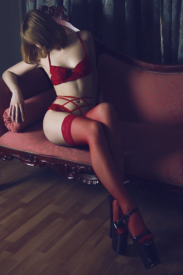
8. Damn good pose and shot and lovely result. I find the woodward along the base of the sofa to be distracting--it captures light and has detail...consider cloning it out or at least darkening and fading it so it's less eye catching. Great pose, lovely color, soft light, beautiful model,....I like just about everything with this shot. Maybe darken the wood behind the model's shoulder so it doesn't draw our eye. Great example of a pose that protects privacy without it looking like someone is trying to hide their face. I think this is a winning shot in color but given some of the shadow and strong lines, I think it would be different but beautiful in B&W as well.






![[No title]](/data/xfmg/thumbnail/42/42397-30faa170de7ed9be38adf00b9b26a220.jpg?1734176928)
![[No title]](/data/xfmg/thumbnail/32/32809-afb9514cb8c02e2e41c241946e185251.jpg?1734162494)