My Sister's Senior Photos

Fingtam

TPF Noob!
Joined
Jan 3, 2012
Messages
55
Reaction score
4
Location
Jacksonville, NC
Can others edit my Photos
Photos OK to edit
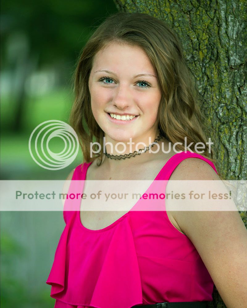
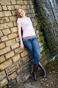
My sister asked me to take her senior photos last month. It was my first time and I kinda wanted to use the experience as a practice try.

I'm including three of my personal favorites and would appreciate any pointers and suggestions for the next time I try this.

Thanks.

1.


2.


3.
 
Last edited:
I did a quick edit. I wish you wouldn't have cut off her arm. I added a little exposure, contrast, clarity, whitened her teeth and eyes, and I think that's it. Nothing fancy.


Jake

Edit: I probably would have had her remove the necklace, unless there is some special meaning attached to it.
 
I like the edited photos.
All photos seems light from the bottom, which does not seem flattering. The edited photo brighten the image and also eliminate the bottom light effect.
 
Thanks for the input.
Not sure if it's just my monitor or what, but her skin looks really bright to me in your edit. However, looking back at the original, I do agree that it could use a little lightening.

I don't think the necklace is super important, but I did ask about it and she said she's been wearing it since kindergarden, so she wanted it in her pics.
(I guess I'm not a very good brother because I don't remember here wearing it all those years.)
 
3 is a bit to tightly cropped, if she plan on framing that ****, she might have her head cut byt the frame. :p
 
I think the first one is best, nice post and expression. But either include the hand or don't....but don't cut it halfway off like that. The light is a little too low, notice how the shadow of her nose is going up her face, not down.

#2 isn't a great pose or crop. Also, for portraits you usually don't want too much skin showing on the shoulders/arms etc. It basically creates large areas of brightness that distract attention away from the face. Again, the crop is awkward in that you cut it off right though her arm & elbow. Either include it or not.

Notice in #3 how, with her arms covered, her face stands out more. I'm not a fan of the tilt here and again, the light is too low. It is nicely soft and directional, so you are certainly on the right track. The pose is a bit awkward again. Her close hand doesn't look great and her whole other arm is invisible. Maybe just minor things, but this is why you practice this stuff...the more you do it, the better you will get at picking out all the little things that can add up to make great photos.

Lots of positive things here, and certainly some room for improvement. Keep shooting :).
 
I did a quick edit. I wish you wouldn't have cut off her arm. I added a little exposure, contrast, clarity, whitened her teeth and eyes, and I think that's it. Nothing fancy.


I dont understand this edit. I see a ghost.
 
This first one is nice, her skin is a bit blotchy,and her hand being clipped is ugh.
Focus is good but skin is too-magenta, chest and upper arm are lighter than face and skin on face needs a bit of work.
Now that I look this may be a bit over-corrected)

10213885323_c605859155_olll2222.jpg~original


Great natural look, still some skin issues, focus is mised a bit (stop using on-camera flash) but that can be corrected.
10213718214_71355ce8f2_olll_pplllll.jpg~original


third the pose is too slanted and there seems to be some perspective distortion (her head looks too small)
She is too beautiful for this shot, I would shoot it again.
 
I really like Lew's crop on the first one, it's the best of them all. When I looked at the original of this one, the eyes did not look tack sharp but at this viewing size, it is fine. (May be my eyes).

The others, I will agree with what has been said here. In #3, to me the posing seems forced and it seems to show in the smile.
 
#3. The crop is too tight above her head. Give her some breathing room. If you're going to go with a tilt, go all the way and create that diagonal. Many don't care for the "Dutch tilt", but it seems to be popular amongst seniors. I don't think that pose works well. She doesn't appear relaxed. Here's my execution of that basic shot.

$stoughton_066.jpg
 
Your images are nice, although the WB seems a bit off in the second one.. as for the edits by other members.. I like none of them. =\
 
I like the 3rd one. Apart from the experts opinion. I love the BG and the composition

Santosh Rane
 
Your images are nice, although the WB seems a bit off in the second one.. as for the edits by other members.. I like none of them. =\

this is a relatively unhelpful comment that does nothing for the OP.
why do you like the OP's pictures and why don't you like the edits?
 
Last edited:
Lew, your first edit is green; it's not QUITE Halloween yet.

I like the crops though.
 

Most reactions

New Topics

Back
Top