Yes, very harsh

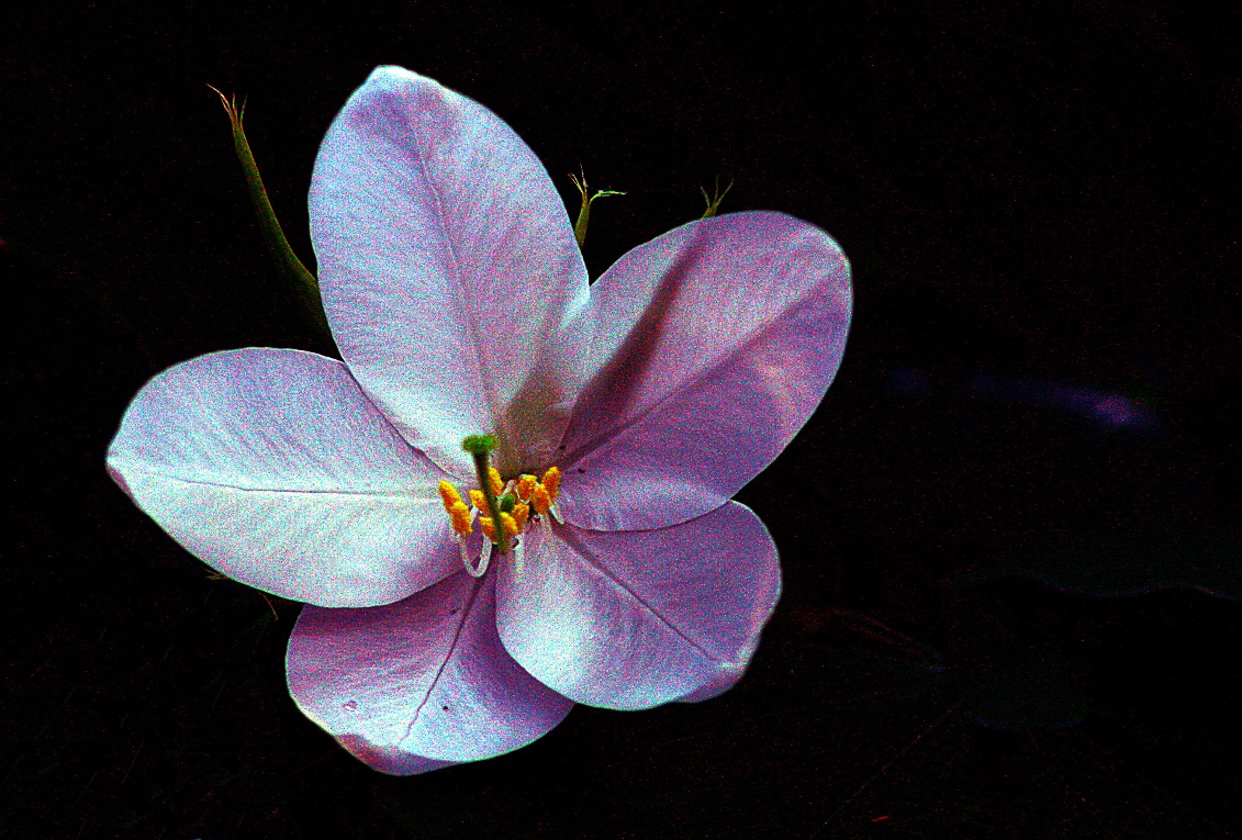
Actually , I do like the colours and the strong contrast (flower, black background).
1) However, colour noise is very pronounced in the flower. If this is a wanted effect, then it is fine, but I would guess it just happened?
2) Composition wise I always prefer the person/object to face towards the empty space in the image. Here the flower faces to the left hand side, and the empty black space is on the right though.
Coming back to the noise, you have a history of noisy images on here
, which is very annoying if an image has fine structures and lots of detail.
In this case, however, there are large areas without detail. The structures shown are simple. Hence the noise works like a texture on a less structured surface. I could imagine a series of images like this one where you actually push this noise on purpose to fill the otherwise featureless surfaces. I would only work on a black background without noise though I suspect.
To make it short, this is one of the very few images, where I think the noise actually might contribute in a positive way!




![[No title]](/data/xfmg/thumbnail/32/32807-d5379cd3a34c7d2ac3535361dd969c10.jpg?1734162489)
![[No title]](/data/xfmg/thumbnail/42/42348-b961c40032587da9952402de14b5976a.jpg?1734176873)

![[No title]](/data/xfmg/thumbnail/42/42350-49b17d39599ec1d51c6d801ea651d3af.jpg?1734176878)
![[No title]](/data/xfmg/thumbnail/32/32808-9d1f657a1903d3bdbd67ea830397d62c.jpg?1734162491)
![[No title]](/data/xfmg/thumbnail/38/38739-1ad36a46750bafbe805f009b4453e8be.jpg?1734172602)