Brooklyn_Guy
TPF Noob!
- Joined
- Jan 9, 2013
- Messages
- 16
- Reaction score
- 0
- Location
- North Hollywood
- Can others edit my Photos
- Photos NOT OK to edit
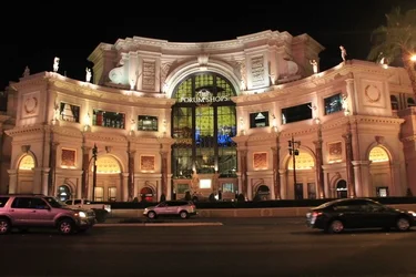
Just at a quick glance, I see that all of them suffer from some sort of tilt or distortion. When using a tripod, make sure it is level. If you are using a ball head, and I suspect you are, just line up one solid vertical with the side of your frame or use a screen grid for the same purpose. Your color balance is off on all of them but the first and probably even that one. Take LaFoto's advice as to posting one or perhaps two at a time for critique.
Hey guys, new to photography and glad I found this site. It has great information. I hope the op doesn't mind me asking, I dont want to take away from his thread, but, when you say "color balance is off"....is that the beige/yellowish tint apparent in the photos except for #1?
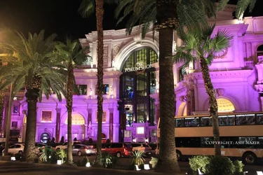
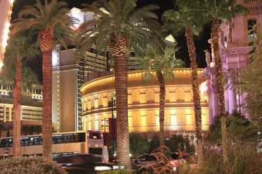
Here are my biases: Small well defined subjects filling the frame. Small can be tall buildings or mountains, but the subject must be clear. For example, of what I would try to avoid, is image #3. Why? I see a lot going on, but it is too much like walking in to a room and seeing clutter (like what my desk looks like most of the time...groan). i see purple light, gold, and glaring white. I see letters I cannot read. I see tress, a bus, random cars and bushes. What is your subject? What do you really want us to notice? I cannot tell from this image.
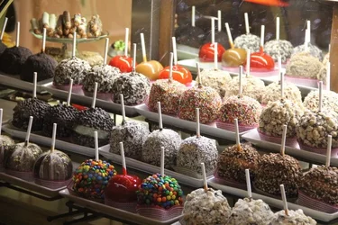
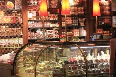
Now images 1 and 2 fit my criteria and so does the "attached thumbnail". I see what you wanted us to see. Your subjects fill the frame without clutter. The first one is my favorite. I like the color, and textures. I like the diagonal angle of the view (as opposed to being straight on). Remember that our attention is drawn to the brightest areas of an image, so I would have like to have seen more of the colorful front row of candies out of the shadow. I want to see more of that area. I see where the artificial light is hitting the frame, so you need to counter that with maybe a fill-in flash or a lightening of your exposure.
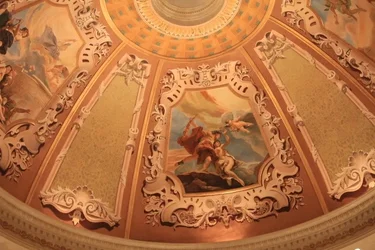
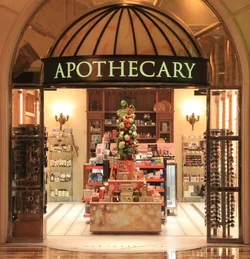
#5 Nice color, balance and symmetry along with a sense of place. Crop in both sides equally. Keep us looking right in the door, our eyes do not ned to be looking at any more of the side wall than necessary, they are not interesting. Keep the emphasis on the center of the image. That is what is interesting to me.
Keep shooting. I can see your creativity sneaking in!

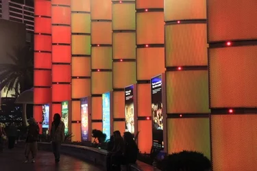
i would say that with the exception of images 5 and 7, your photos lack a clearly defined subject. if the viewer can't tell what you're trying to show them, the rest becomes a technical exercise which is good, but you might as well think about what you're saying while you're doing it.![]()
You may want to edit this one.
In general, what I see is you are picking out subjects that can/would be interesting and not QUITE executing on them. The first part is harder to learn than the second so you're in good shape.
Here are my biases: Small well defined subjects filling the frame. Small can be tall buildings or mountains, but the subject must be clear. For example, of what I would try to avoid, is image #3. Why? I see a lot going on, but it is too much like walking in to a room and seeing clutter (like what my desk looks like most of the time...groan). i see purple light, gold, and glaring white. I see letters I cannot read. I see tress, a bus, random cars and bushes. What is your subject? What do you really want us to notice? I cannot tell from this image.
Now images 1 and 2 fit my criteria and so does the "attached thumbnail". I see what you wanted us to see. Your subjects fill the frame without clutter. The first one is my favorite. I like the color, and textures. I like the diagonal angle of the view (as opposed to being straight on). Remember that our attention is drawn to the brightest areas of an image, so I would have like to have seen more of the colorful front row of candies out of the shadow. I want to see more of that area. I see where the artificial light is hitting the frame, so you need to counter that with maybe a fill-in flash or a lightening of your exposure.
#5 Nice color, balance and symmetry along with a sense of place. Crop in both sides equally. Keep us looking right in the door, our eyes do not ned to be looking at any more of the side wall than necessary, they are not interesting. Keep the emphasis on the center of the image. That is what is interesting to me.
Keep shooting. I can see your creativity sneaking in!