Neglected Stars n Stripes

Jaemie

No longer a newbie, moving up!
Joined
Apr 27, 2012
Messages
1,907
Reaction score
340
Location
Puyallup, WA
Website
www.jaemierobinson.com
Can others edit my Photos
Photos OK to edit
I saw this poor flag on a recent walk, but didn't think to photograph it until I saw I could incorporate the barbed wire in the foreground. It's property of a local small business. Generally, I avoid social and political photography; I just do not feel drawn to it. Something about this flag bothers me, though. Perhaps it's the way it's been neglected. I think if you feel so patriotic as to erect a tall flagpole and fly the Stars and Stripes, then you should care for it with equal dedication and passion.

I'm mostly interested in compositional and technical feedback, but any other thoughts are welcome, too.
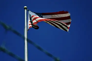
$Flag 2.jpg
 
I believe that it's composed pretty nicely, it's following the rules of thirds being in the upper section. Making the decision to include the barbed wire also gave the picture some depth to it compared to if it was just blue sky and flag. Did you use a polarizing filter to get the sky so blue or was it post production?
 
I think in the next instant when the wind exposes the stars and stripes completely, you would have change your mind.... ;)

I liked the way you presented it, the barbed wires can give different interpretations; good simple work :D
 
I like it. The strong vibrant colors of the flag and blue sky coupled with the barrbed wire, turns it from a snap shot to a strong composition that makes a statement on several levels.
 
IMO, no.
The bright colors and the 'healthy fabric' fight the impression you want to give, I think.
Bright flag and barbed wire ('bob wire' in someplaces) aren't a coherent statement, imo.

Lew
 
Last edited:
I agree (I think) with Lew. Desaturation might strengthen this image and bring it more in line with the title.
 
Thank you to everyone for your comments and suggestions. Yes, I adjusted the saturation in PS. The sky was a very deep blue, perhaps not equal to the photo, but close.

I'm experiencing different color saturation levels between PS CS5 (12.1, x64), Windows Photo Viewer, Paint.NET(v3.5.10), Chrome (18.0.1025.168), Internet Explorer (9.0.6), and even on Wordpress. It's very annoying to adjust an image in PS only to see it appear differently on my website and differently again on this forum. I use Chrome 95% of the time, but peek at my images on IE or Firefox to see what users on those browsers will experience. I've googled and discovered this variation in color between browsers isn't so uncommon, but I haven't found a fix yet. Any ideas?

Here is an alternative:

#2

$Flag 2 desaturated 2.jpg
 
I believe that it's composed pretty nicely, it's following the rules of thirds being in the upper section. Making the decision to include the barbed wire also gave the picture some depth to it compared to if it was just blue sky and flag. Did you use a polarizing filter to get the sky so blue or was it post production?

Thank you. :) Post production - PS CS5.
 
Choice of DOF is very subjective of course, and there seems to be a tendency by many to keep it as shallow as possible so as to make the subject "pop", but here I think the barbed wire being so OOF is quite distracting. I think the shot would work better if the barbed wire were sharper.
 
RAW or JPEG? What color space are you using? If you're using Adobe RGB and are not converting to sRGB before posting online, there will be color shifts as browsers (and many print labs) will assume sRGB, which has fewer colors than adobe, prophoto, etc.
If you're shooting RAW, there is no color space until you assign it during processing so the in-camera setting is irrelevant. If CS5/ACR and the rest of the software in your workflow is set to use Adobe RGB, be sure to change to sRGB before posting online and check with your print lab to see which they prefer.

Monitor calibration is also important, but if you're seeing shifts between programs I would suspect the color space first.

HTH

Thank you, HTH. I am going to examine all of this later this evening. :)
 
Choice of DOF is very subjective of course, and there seems to be a tendency by many to keep it as shallow as possible so as to make the subject "pop", but here I think the barbed wire being so OOF is quite distracting. I think the shot would work better if the barbed wire were sharper.

I really like this flag and at some point I'm going to re-shoot it with greater DOF. In the meantime, here is a different image (same flag) I shot with the barbed wire in focus and the flag OOF, with a close up on the rusty wire. Unfortunately, cropping greatly affected the resolution.

$Flag 5.jpg
 

Most reactions

Back
Top