Nice effort.
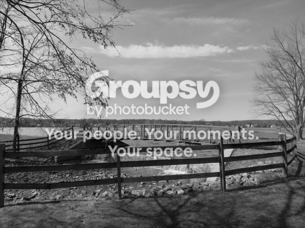
B&W dies require a different approach than colour. BAck in my early days there was little colour about and it was hard to process so B&W was the best option. Look for good contrast in the scene. Use the backs and whites to hide, accentuate, frame, isolate the subject of the image. Give your picture a good range of shades of grey (see Zone).
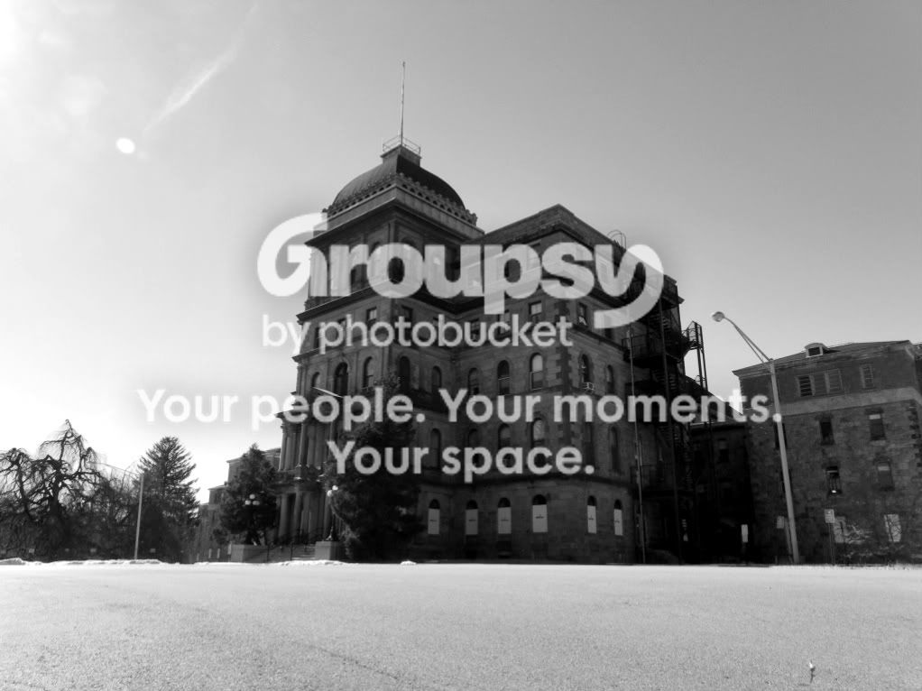
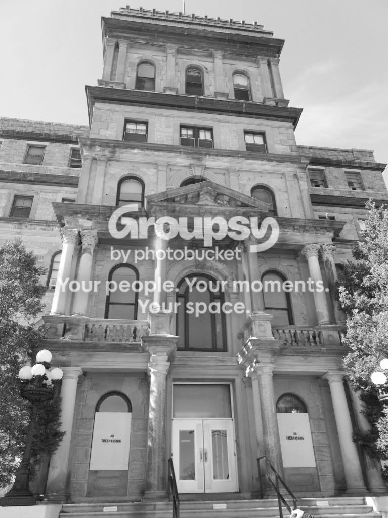
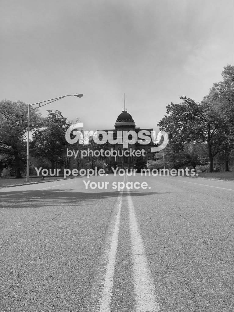
I might suggest a few things about the images in general. Its nice tou are using forgraound but watch that it doesn't detract from the image. It still needs to be interesting. The shot with the building and the road for example. Yopu might have hung around and got someone crossing the road, especially coming in from the left.
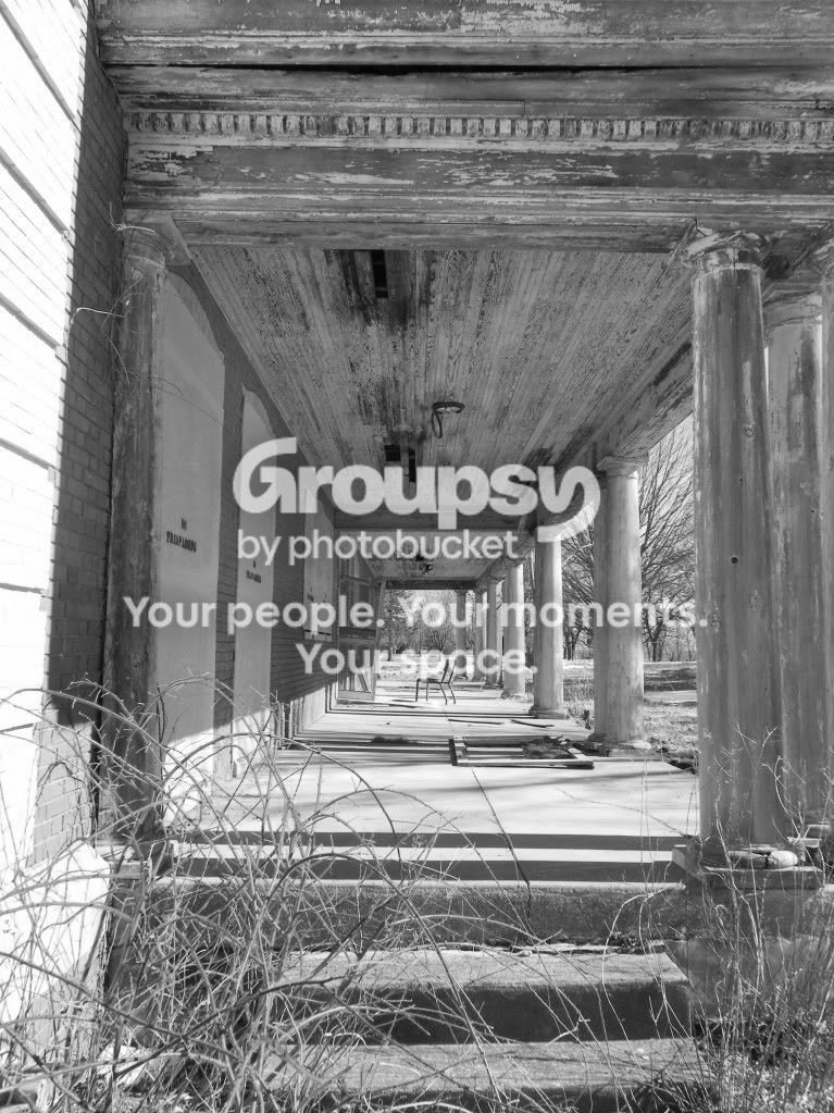
The chair on the porch is a nise focal point. Get in a bit closer and use the lines to draw the eye to it.
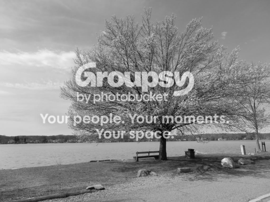
Its a nice tree and sky. Make it the focus of the picture and get rid of the other stuff. Darkening the sky a shade and lifting the highlights in the tree help to dramatise the image a bit.
Its OK to think the scene is interesating enough to photograph but it will then need to be translated for the viewer. They don't have what you have. They weren't there. Give them something that will take them there.
Oh, and some stuff works better in colour.
Best of.
tom



![[No title]](/data/xfmg/thumbnail/34/34115-73b827c6a6db1413dcead11e4caaae69.jpg?1734164571)
![[No title]](/data/xfmg/thumbnail/37/37606-3c9ffb5906173fa2aa489341967e1468.jpg?1734170733)
![[No title]](/data/xfmg/thumbnail/37/37604-7ad625e983f92f880eb65a264eeef5e4.jpg?1734170732)
![[No title]](/data/xfmg/thumbnail/30/30880-eb7252c7e6df26b6cbc7065d2838df96.jpg?1734158883)