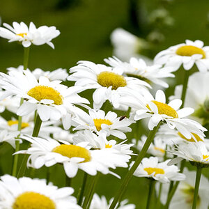
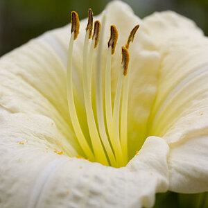
I really like the first one! The colors, texture, and lighting makes it seem warm and inviting. Might have been a bit better if the wheat strand in the front was all in focus (the bit at the top gets fuzzy).
Dave Chappelle would have said: "You're too close man, you're too close!"
First one, nice colors but you focused on the "second row" instead of the first one. And backing up would have helped too. Frame looks a bit cramped. Otherwise nice.
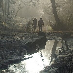
I don't like the others too much. The canal looks filthy, not pleasant to look at.


![[No title]](/data/xfmg/thumbnail/40/40307-b3813381d3c1ef8282c72905405b50fe.jpg?1619739413)
![[No title]](/data/xfmg/thumbnail/34/34072-be456691237ae73cb2936416e2e9e8c0.jpg?1619736266)
![[No title]](/data/xfmg/thumbnail/32/32003-70dfe149c27224e28ba98e975984e01e.jpg?1619735147)