What's new

New to the group CC please :)

tmf101610

TPF Noob!
Joined
Aug 15, 2012
Messages
8
Reaction score
1
Location
Rochester, NY
Can others edit my Photos
Photos NOT OK to edit
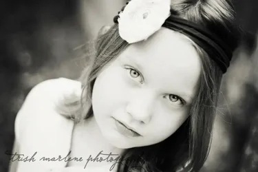
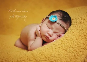
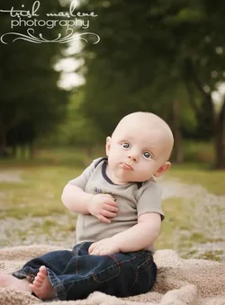
Hey everyone! I've been in love with photography for 10 years. I worked for a portrait studio where I learned most of what I know. Here are some examples of my work. CC please and thank you!!
$418201_373094836093448_1997592099_n.webp

$580710_312881142114818_1136734537_n.webp$549225_332530750149857_1863082140_n.webp

Trish
 
Are the kids in all your photographs oriented the same way? ;)

The first one is surprisingly blah. It looks like natural light on an overcast day, which is unfortunate. Cute kid, otherwise well handled, I think. It looks very slightly soft, but that could just be the JPEG compression and the small image.

The second one is lovely. I like the girl's expression. The lack of modeling in a face isn't *super* appealing to me, but it's definitely a look that we all know, and you did it well.

The third is much the same -- another familiar look, well handled.

I like the first one for not cleaving to hyper-familiar tropes, but I dislike it because of the light.
 
Thank you! What do you suggest for the first one to make it not so blah? It was overcast. It had actually just rained about an hour before hand.
 
Either wait for better light, or use a flash! You can either make light, or wait for it!

You COULD try warming the color temperature up a little. I won't change the flatness of the light, but it would make it look less chilly.
 
I rather like 1 and 2 (2 is overexposed in areas). The third looks too posed, though I understand it's the kind of photo that's very popular with many people.

Minor rant: I'm one of those people who are often annoyed by big, showy signatures. In addition to being large and a little pretentious, your's changes style and font from photo to photo. Why? If it has to be there in all of it's flamboyant glory, at least keep it consistent throughout your work.
 
Minor rant: I'm one of those people who are often annoyed by big, showy signatures. In addition to being large and a little pretentious, your's changes style and font from photo to photo. Why? If it has to be there in all of it's flamboyant glory, at least keep it consistent throughout your work.

It looks to me like #2 and #3 are the same font, but the difference is in the size and the layout. #2 has only one line, and #3 has two lines. Also, #2 is larger font than in #3. If I were to express my preference of the three, I would pick #1. #1 has the word "photography" in a sans serif font that I think works well here. And I love the triple-swirl squiggly thing under the text.
 
I rather like 1 and 2 (2 is overexposed in areas). The third looks too posed, though I understand it's the kind of photo that's very popular with many people.

Minor rant: I'm one of those people who are often annoyed by big, showy signatures. In addition to being large and a little pretentious, your's changes style and font from photo to photo. Why? If it has to be there in all of it's flamboyant glory, at least keep it consistent throughout your work.


The last two was my old watermark. As you said, I found it inconsistent. The fonts in #2 and #3 are the same font, but different size and (obviously) different layouts. So I changed it to the watermark in the first picture. Which is a photoshop file that I drag to every picture I'd use for the internet.
 

Create an account or login to comment

You must be a member in order to leave a comment

Create account

Create an account on our community. It's easy!

Log in

Already have an account? Log in here.

New Topics

Back
Top Bottom