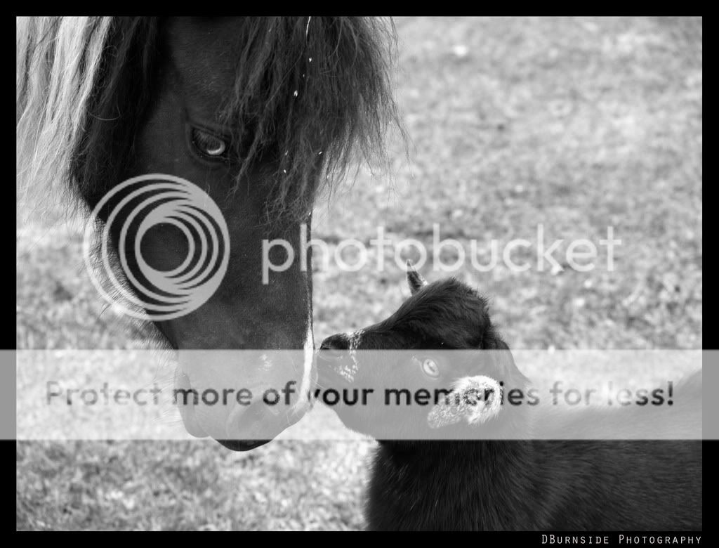
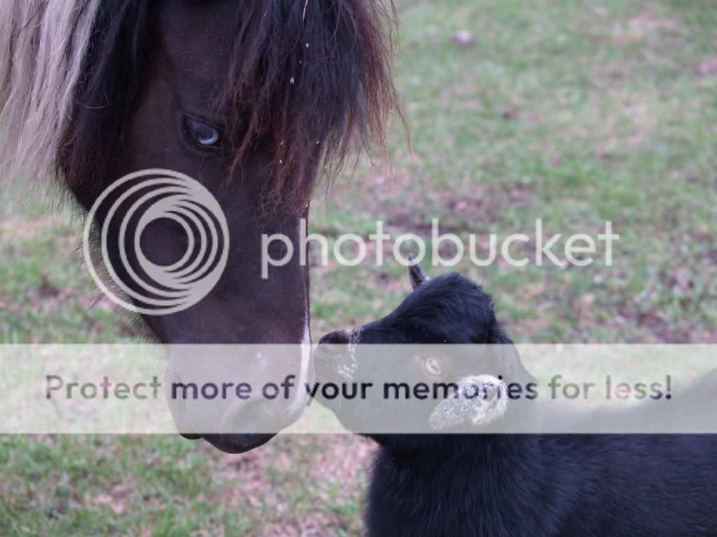
I find very little to pick at here. The black and white conversion works pretty well. The color version has a fairly strong magenta cast. I played with the color in graphics software; selecting a white point from the goat's ear, and black point from the dark spot under his chin corrected the color cast pretty well. The green grass really stood out to me then, but desaturating the green channel toned it down pretty well.
It looks like the pony is looking at you, but not much you can do about that.
Dead space doesn't bother me, but you could try a closer vertical crop showing just the critters' faces.
Other than that, it looks good to me.
")


![[No title]](/data/xfmg/thumbnail/32/32177-3a3d923fa1584c6ef7d6602aaa24fbc6.jpg?1734161047)


![[No title]](/data/xfmg/thumbnail/32/32178-010a47bfeb945bdafb02b0ee4888290c.jpg?1734161047)


![[No title]](/data/xfmg/thumbnail/30/30884-b92cca2d3ad6f728825cf7e936e8cef6.jpg?1734158887)

![[No title]](/data/xfmg/thumbnail/31/31744-f06a1a9bb9c74e3b8b332878f5fe71f1.jpg?1734160459)
![[No title]](/data/xfmg/thumbnail/30/30883-04222f7ae234efdf80dff6f96ddad16f.jpg?1734158884)